Introduction
Consumer demand is the heartbeat of every business, shaping decisions on production, marketing, and strategic investments. In today’s rapidly evolving market, understanding shifts in consumer preferences is crucial for staying ahead of the competition. By analyzing data related to sales, order demand, and geographic trends, companies can fine-tune their strategies and capture emerging opportunities. This article explores how a comprehensive analysis of consumer demand can uncover hidden patterns, identify bottlenecks, and support data-driven decision-making.
Problem Statement
Despite the abundance of data available today, many organizations struggle to extract actionable insights from raw consumer demand metrics. Traditional reporting methods often lack the interactivity and depth needed to uncover subtle trends or diagnose performance issues. This gap can lead to missed opportunities, inefficient resource allocation, and delayed responses to market changes.
The challenge lies in creating a unified analytical framework that not only tracks overall performance but also dissects consumer demand across time, product categories, and geographic regions. This is where a well-designed dashboard can bridge the gap between data and decision-making.
How the Analysis Helps Identify Problems and Opportunities
By employing a structured, multi-page dashboard, businesses can transform complex datasets into a series of intuitive visualizations that highlight both strengths and weaknesses. The analysis helps in several key areas:
- Identifying Trends: Recognize seasonal variations and time-based patterns that can signal emerging consumer preferences.
- Spotting Bottlenecks: Detect operational inefficiencies such as declining product performance or regional supply issues.
- Uncovering Opportunities: Pinpoint high-demand areas and product categories that are ripe for further investment or expansion.
- Data-Driven Decisions: Empower management to make informed decisions with clear, real-time insights.
This structured approach is embodied in four distinct report pages, each focusing on a different aspect of consumer demand.
Report Pages & Visualizations
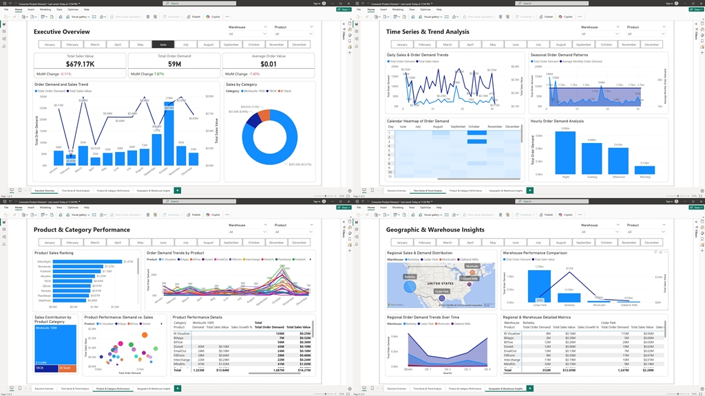
1. Executive Overview
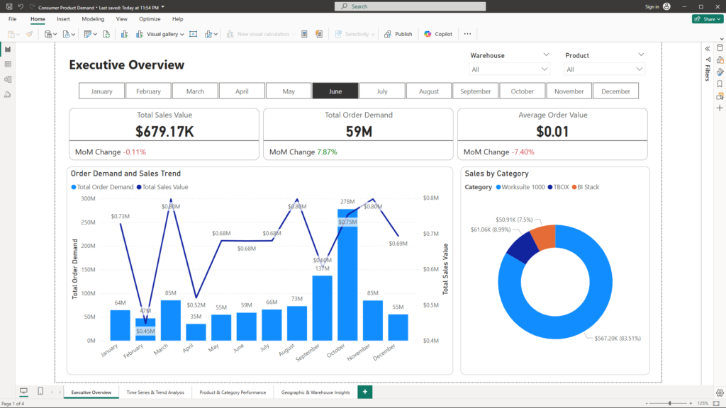
Purpose:
Provide a high-level snapshot of overall performance that offers immediate, actionable insights for top management.
Key Visualizations:
- KPI Cards:
These cards display critical metrics such as Total Sales Value, Total Order Demand, and Average Order Value. They include trend indicators and percentage changes, enabling decision-makers to quickly assess current performance against past periods. - Overall Trend Analysis:
A multi-series line or combo chart visualizes the trend of order demand and sales value over time. This visual allows management to compare multiple measures on a single timeline, highlighting the broader market dynamics. - Category Contribution:
A pie chart illustrates the percentage contribution of each product category to overall sales. This helps quickly identify which segments are driving revenue and which may need additional focus. - Navigation & Filters:
Slicers for date ranges, product categories, and regions provide the flexibility to drill down into specific data segments, tailoring the analysis to current needs.
2. Time Series & Trend Analysis
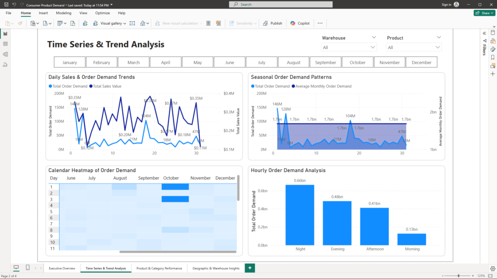
Purpose:
Dive into the temporal dynamics of consumer demand to reveal trends, seasonal patterns, and potential anomalies.
Key Visualizations:
- Detailed Time Trends:
A multi-series line chart plots both order demand and sales over time. With the ability to differentiate between product categories, this visualization helps pinpoint daily, weekly, or monthly trends that might otherwise be overlooked. - Seasonality Visualization:
An area chart emphasizes seasonal patterns in order demand. By highlighting peak performance periods and seasonal dips, the chart helps in forecasting and planning. - Heatmap Style Calendar:
A matrix visual, formatted as a calendar, uses conditional formatting to indicate high and low order volumes. This provides a quick visual cue for days with exceptional performance or anomalies. - Time-of-Day Analysis:
A clustered column chart segmented by hour of the day identifies peak ordering times. This helps optimize staffing, marketing campaigns, and operational planning based on consumer activity patterns. - Interactive Filters:
Slicers for date ranges and time segments refine the analysis, ensuring the visualizations are always aligned with the current focus of the analysis.
3. Product & Category Performance
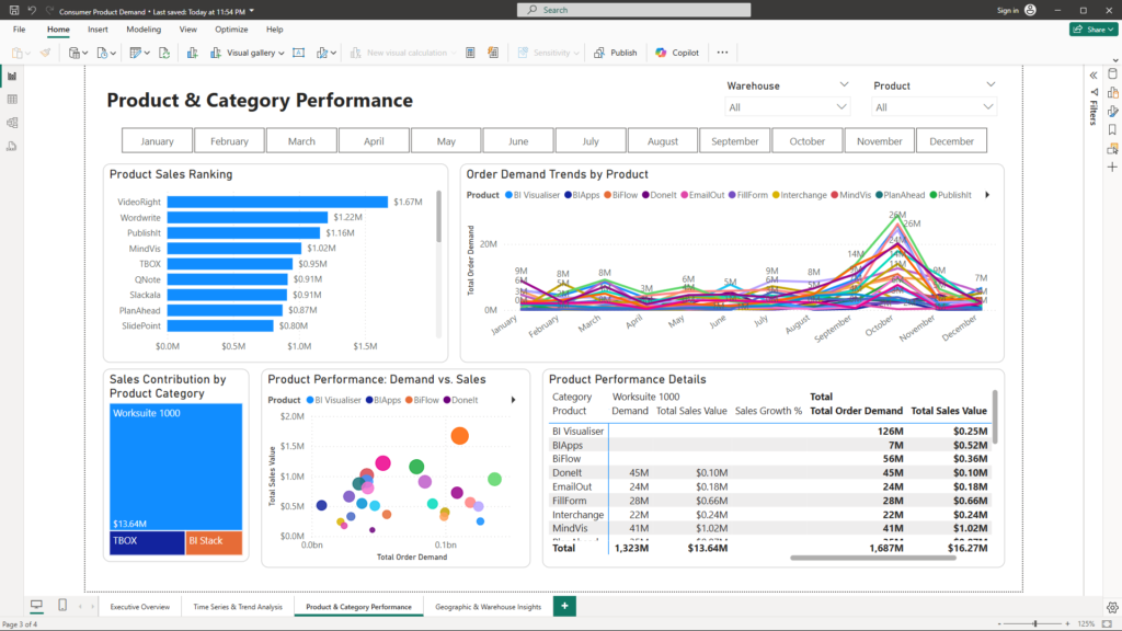
Purpose:
Offer a granular view of individual product performance and overall category contributions to identify both top performers and areas needing improvement.
Key Visualizations:
- Product Sales Ranking:
A clustered bar chart ranks products by sales value, allowing for quick identification of top-performing and lagging products. Sorting and ranking measures enhance this view. - Demand Trends per Product:
A line chart visualizes order demand trends for selected products over time. This comparison helps evaluate consistency and detect sudden shifts in performance. - Category Breakdown:
A treemap showcases the relative contribution of each product category to total sales. This visual aids in understanding the weight of each segment within the broader portfolio. - Performance Scatter Plot:
A scatter chart plots products by order demand on the X-axis versus sales value on the Y-axis. With bubble sizes representing volume or market share, it highlights outliers and products with imbalanced performance metrics. - Detailed Data Table:
A table or matrix visual lists products along with key metrics such as order demand, sales value, and growth percentages. This detailed view complements the graphical insights with exact figures. - Interactive Filters:
Slicers for products, categories, and time periods enable targeted analysis, ensuring that the visualizations respond dynamically to user selections.
4. Geographic & Warehouse Insights
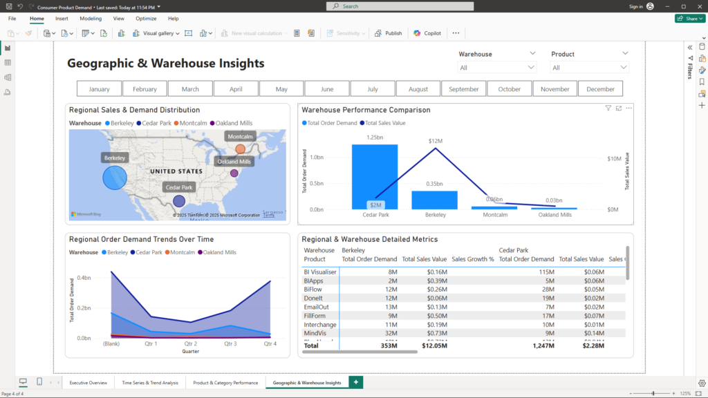
Purpose:
Reveal regional performance trends and warehouse-specific operational insights to address geographic and logistical challenges.
Key Visualizations:
- Geographic Distribution:
A filled map (Choropleth) or bubble map shows sales and order demand by Zip code. This visualization pinpoints high-demand regions and identifies underperforming areas for targeted action. - Warehouse Comparison:
A clustered column chart compares performance metrics such as sales and order demand across different warehouses. It helps assess the operational efficiency at each location. - Regional Performance Over Time:
A stacked area or line chart displays how order demand evolves over time across different regions. This helps identify regions with growing potential or areas in decline. - Detailed Regional Matrix:
A matrix visual breaks down orders by region, warehouse, and product, allowing for a detailed cross-comparison of metrics. Conditional formatting can be applied to highlight critical performance indicators. - Interactive Filters:
Slicers for warehouse, region, and Zip code ensure that users can tailor the analysis to focus on specific geographic areas, further refining the insights.
Conclusion
Understanding consumer demand is essential for capturing growth opportunities and addressing operational challenges. A well-designed dashboard—including an Executive Overview, Time Series & Trend Analysis, Product & Category Performance, and Geographic & Warehouse Insights—provides a holistic view of the business landscape. By transforming raw data into interactive, insightful visualizations, companies can detect problems early and uncover opportunities to drive strategic growth and improve overall performance.
This structured, data-driven approach empowers management to make informed decisions, ensuring that every operational and strategic move is backed by clear, actionable insights from consumer demand analysis.
For more information on how to harness data for smarter decision-making and strategic marketing, please contact us at mail@ssghsoal.com. Let us help you unlock the full potential of your consumer demand data!