In today’s fast-paced restaurant industry, making informed decisions quickly is key to staying competitive. At our firm, we take raw data—often a collection of timestamps, order details, and financial transactions—and transform it into clear, visual reports that reveal underlying operational and financial trends. This data storytelling approach enables top management to identify problems, seize opportunities, and implement strategic solutions.
Below, I outline a comprehensive five-page Power BI dashboard built from restaurant data, and explain how each report page and its visualizations empower business leaders to optimize performance.
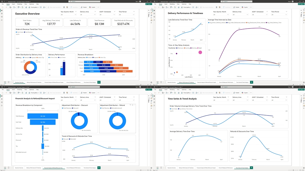
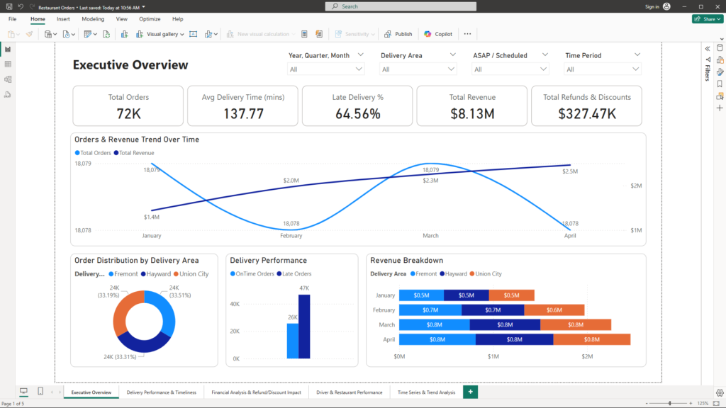
1. Executive Overview
Objective:
Provide a high-level snapshot of overall performance with key metrics at a glance.
What’s Inside:
- High-Level KPIs: Total orders, average delivery times, percentage of late deliveries, total revenue, and the financial impact of refunds and discounts.
- Visuals: Card visuals highlight each KPI, while a summary bar or gauge chart illustrates overall service quality (on-time vs. delayed deliveries).
- Slicers: Easily filter the data by date range, delivery area, and whether orders were delivered ASAP or scheduled.
Business Benefit:
Top management can instantly assess the restaurant’s operational efficiency and financial health. This overview serves as the starting point for more in-depth analysis, guiding strategic decisions such as resource allocation or process improvements.
2. Delivery Performance & Timeliness
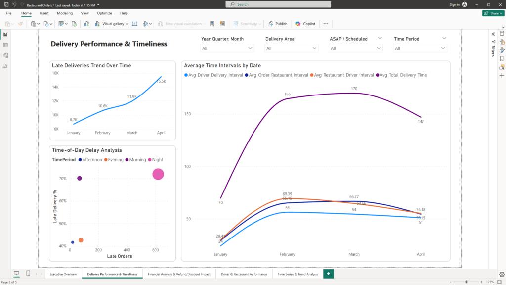
Objective:
Deep dive into the operational efficiency of the delivery process and pinpoint the specific stages causing delays.
What’s Inside:
Delivery Time Analysis
- Calculated Time Intervals:
- Measures such as “Order Time to Restaurant Time,” “Restaurant Time to Driver Arrival,” and “Driver Arrival to Delivery Time” are computed.
- Additional measures include Avg_Driver_Delivery_Interval, Avg_Order_Restaurant_Interval, Avg_Restaurant_Driver_Interval, and Avg_Total_Delivery_Time, which are used to track and compare the average time taken at each stage over time.
- Visuals:
- Average Time Intervals by Date (Line Chart):
This line chart plots the four average interval measures over time, providing a clear view of trends and variations across the entire delivery process. - Late Deliveries Trend Over Time (Line Chart):
This visual highlights how the volume of late deliveries changes over time, helping to identify patterns or periods of increased delay.
- Average Time Intervals by Date (Line Chart):
Late Delivery Insights
- Thresholds for Delay:
- A delay is flagged when the time interval from driver arrival to delivery exceeds a predetermined threshold (e.g., 30 minutes).
- Visuals:
- Time-of-Day Delay Analysis (Scatter Plot):
This scatter plot maps individual orders by their order hour against the total delivery interval, using color or size to differentiate late orders. It visually reveals peak delay periods and whether delays are concentrated during specific times or related to particular drivers or restaurants.
- Time-of-Day Delay Analysis (Scatter Plot):
Business Benefit:
Executives can quickly pinpoint bottlenecks—whether in order processing, restaurant preparation, or driver performance—and take targeted actions to improve efficiency. The combination of line charts and scatter plots provides both a high-level overview of trends and a granular view of delays, ensuring timely deliveries and enhanced customer satisfaction.
3. Financial Analysis & Refund/Discount Impact
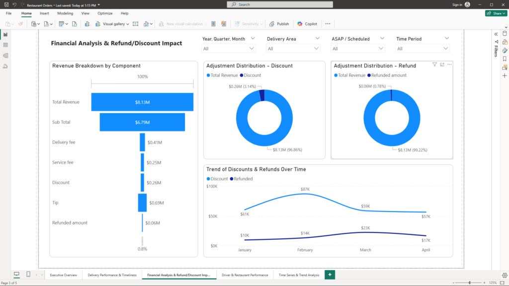
Objective:
Break down revenue streams and understand the financial implications of discounts and refunds to support strategic pricing and cost management decisions.
What’s Inside:
Revenue Breakdown
- Revenue Breakdown by Component:
- Calculated Metrics: The report dissects revenue into its core components—sub-total sales, delivery fees, service fees, and tips.
- Visual: A Tree Map displays the contribution of each revenue component, offering an immediate visual representation of which elements drive overall revenue.
Adjustments Analysis
- Discounts & Refunds:
- Detailed Insights: The financial impact of adjustments is measured by separately aggregating discounts and refunded amounts.
- Visuals:
- Adjustment Distribution – Discount (Donut Chart): This donut chart shows the share of total discounts applied, helping pinpoint how frequently and significantly discounts impact revenue.
- Adjustment Distribution – Refund (Donut Chart): Similarly, this donut chart illustrates the distribution of refunded amounts, highlighting the financial burden of refunds on the business.
Trend Analysis
- Trend of Discounts & Refunds Over Time:
- Visual: A Line Chart tracks the combined adjustments (discounts and refunds) over time, revealing trends, seasonal spikes, or anomalies that may call for deeper investigation.
Business Benefit:
This comprehensive report enables executives to visualize revenue drivers and the cost of financial adjustments at a glance. By understanding the revenue breakdown and tracking the trends in discounts and refunds, management can fine-tune pricing strategies, improve promotional efficiency, and take proactive steps to minimize revenue leakage—ultimately driving enhanced profitability.
4. Driver & Restaurant Performance
Objective:
Evaluate and compare the performance of drivers and restaurants to identify top performers and areas for improvement.
What’s Inside:
Driver Performance
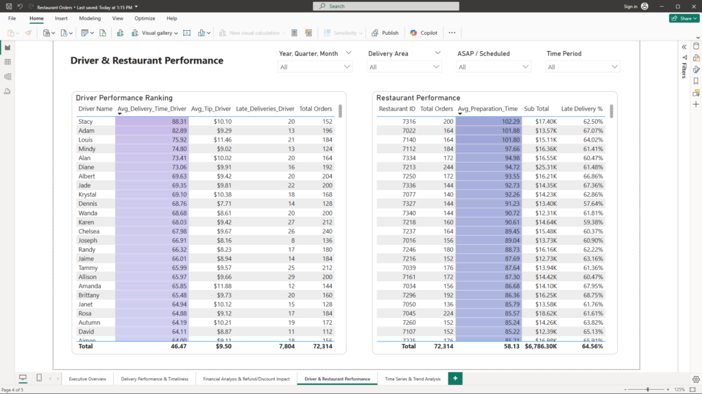
- Driver Performance Ranking:
- Key Metrics: This table summarizes critical driver metrics such as average delivery time (calculated from driver arrival to delivery time), average tip amounts, and late delivery counts.
- Visual: The Driver Performance Ranking table provides a clear, ranked view of driver performance, enabling quick identification of consistent high performers and those requiring support or training.
Restaurant Performance
- Restaurant Performance Overview:
- Key Metrics: This table includes metrics like order volume, average preparation time (from order placement to restaurant processing), and any related delays.
- Visual: The Restaurant Performance table offers an at-a-glance comparison across restaurants, highlighting both best and worst performers to inform targeted operational improvements.
Business Benefit:
By leveraging these performance tables, executives can make data-driven decisions regarding driver incentives, training programs, and operational adjustments at the restaurant level. This targeted approach helps improve service quality, enhance customer satisfaction, and drive overall efficiency in the delivery process.
5. Financial Analysis & Refund/Discount Impact
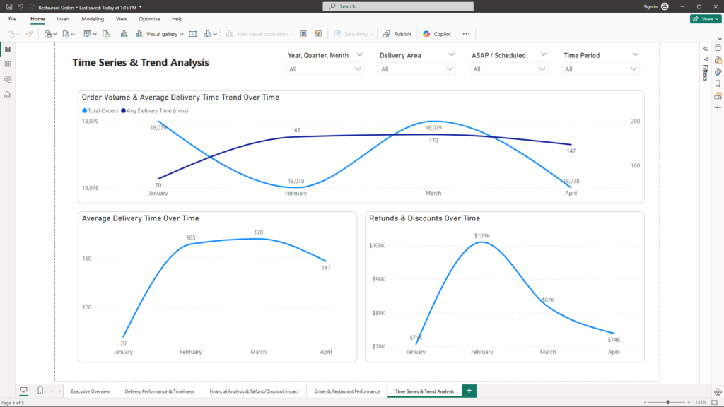
Objective:
Analyze the financial performance by tracking key operational metrics alongside the trends in refunds and discounts, to help management understand revenue dynamics and identify areas for improvement.
What’s Inside:
Trend Analysis
- Order Volume & Average Delivery Time Trend Over Time (Line Chart):
- Description: This combined line chart shows how order volume and average delivery times evolve over a specified period. It enables executives to see correlations between high order periods and operational efficiency, helping to identify potential bottlenecks during peak times.
- Average Delivery Time Over Time (Line Chart):
- Description: This focused line chart tracks the average delivery time, allowing management to monitor improvements or deteriorations in delivery efficiency. It provides insight into the operational effectiveness of the delivery process.
- Refunds & Discounts Over Time (Line Chart):
- Description: This visual illustrates the trends in refunds and discounts over time. It highlights periods with significant financial adjustments, which may indicate service issues or the impact of promotional campaigns.
Business Benefit:
This comprehensive trend analysis allows executives to correlate order volume and delivery performance with financial adjustments. By monitoring these key metrics, management can:
- Identify periods of operational strain that may require additional resources.
- Fine-tune promotional and pricing strategies based on refund and discount patterns.
- Drive improvements in overall service quality and revenue optimization.
Conclusion
In transforming raw restaurant data into clear, actionable insights, we’ve demonstrated how data storytelling can drive strategic decision-making. By examining high-level performance metrics, delivery efficiency, financial trends, and driver/restaurant performance, each report page offers a distinct perspective on the business. This comprehensive approach not only identifies operational bottlenecks and financial leakages but also highlights opportunities for targeted improvements and strategic resource allocation.
Empower your business with the precision of data-driven insights that unlock hidden efficiencies and drive revenue growth. Discover how a tailored, visual approach can transform your restaurant operations and pave the way for sustained success. Connect with us at mail@ssghosal.com to start your journey toward operational excellence.