Introduction
In today’s fast-paced business world, making informed decisions is the cornerstone of sustained success. One often-overlooked challenge is employee absenteeism, which directly impacts productivity and profitability. Using Power BI, I have developed a comprehensive, multi-page report that transforms raw absenteeism data into actionable business insights. This case study showcases how a strategic dashboard can pinpoint problems, highlight opportunities, and ultimately guide effective decision-making.
Problem Statement
High employee absenteeism is more than just a staffing issue—it is a symptom of underlying operational challenges that can erode efficiency and increase costs. Business leaders need a clear, visual method to analyze absenteeism trends by division, department, and employee demographics. Without actionable insights, organizations risk misallocating resources and failing to address systemic issues that hurt performance.
The Power BI Solution
My Power BI solution consists of four detailed report pages, each designed to tackle a different aspect of the absenteeism challenge. The solution highlights key metrics and deep dives into departmental, demographic, and individual insights—all in one interactive dashboard.
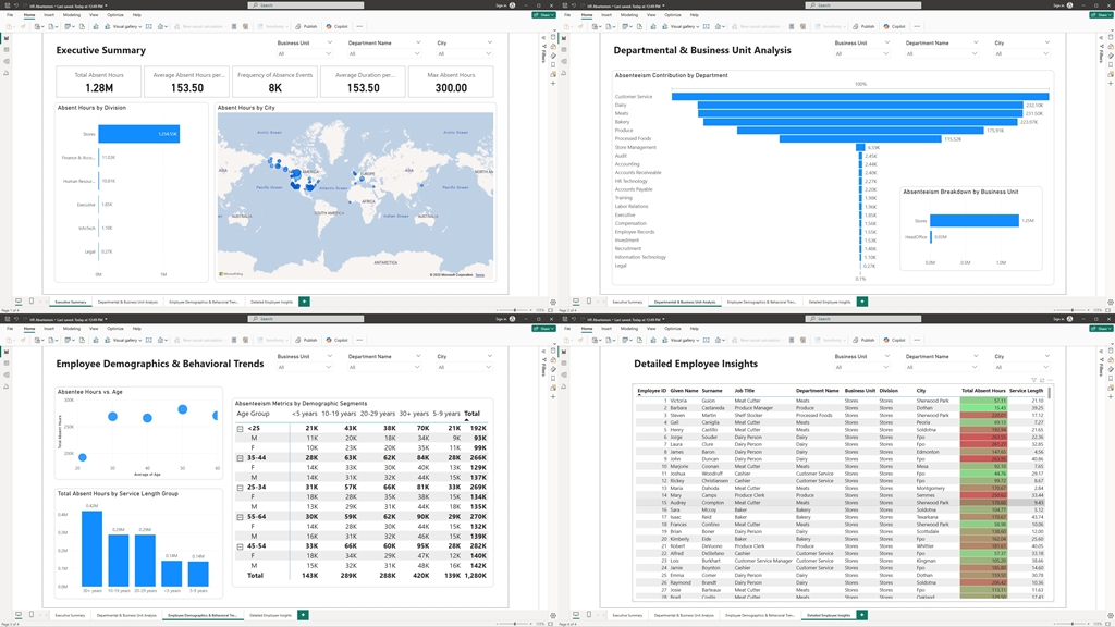
1. Executive Summary
Objective:
Provide top-level insights into overall absenteeism, enabling leadership to quickly gauge the health of the organization.
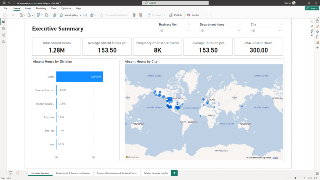
Visualizations & Benefits:
- KPI Cards:
Display critical numbers such as:- Total Absent Hours: The sum of all lost hours.
- Average Absent Hours per Employee: An indicator of individual impact.
- Additional KPIs (such as frequency and average duration) provide context on how often and how long absences occur.
- Stacked Bar Chart – Absent Hours by Division:
This chart breaks down absentee hours by division, highlighting which divisions are most affected. Business Impact: Identifying high-impact divisions allows for targeted interventions and better resource allocation. - Map – Absent Hours by City:
A geographic visualization that shows absenteeism intensity by city. Business Impact: Regional patterns can inform location-based strategies, such as local employee engagement programs or tailored HR policies.
2. Departmental & Business Unit Analysis
Objective:
Analyze absenteeism at a more granular level to identify departments and business units with critical performance gaps.
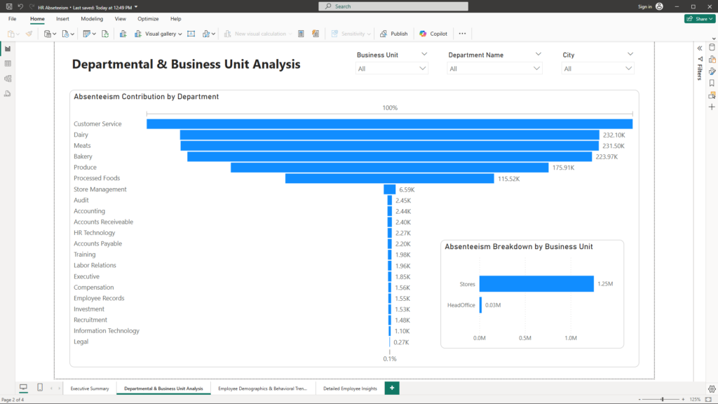
Visualizations & Benefits:
- Waterfall Chart – Absenteeism Contribution by Department:
This chart clearly shows how each department contributes to overall absenteeism—both positive and negative changes are visualized. Business Impact: It enables leaders to spot departments that are outliers, prompting further investigation and remedial action. - Bar Chart – Absenteeism Breakdown by Business Unit:
A straightforward bar chart that compares absenteeism across different business units. Business Impact: By understanding which business units struggle the most, management can allocate resources and design targeted improvement programs.
3. Employee Demographics & Behavioral Trends
Objective:
Examine how employee characteristics correlate with absenteeism to uncover hidden trends and inform targeted HR strategies.
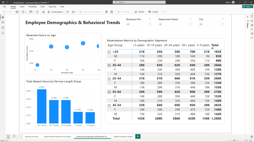
Visualizations & Benefits:
- Scatter Plot – Absentee Hours vs. Age:
This plot explores the relationship between employee age and absenteeism. Trend lines reveal whether certain age groups are more prone to absence. Business Impact: Recognizing trends related to age can inform retention strategies and the design of support programs for different employee segments. - Column Chart – Total Absent Hours by Service Length Group:
Employees are grouped into bins based on their service length, and the total absent hours for each group are compared. Business Impact: This visualization helps identify whether longer-serving or newer employees are contributing more to absenteeism, guiding training and support initiatives accordingly. - Matrix – Absenteeism Metrics by Demographic Segments:
A detailed matrix displays absenteeism metrics segmented by factors such as age group, gender, and service length. Business Impact: The matrix provides a granular view, enabling leaders to pinpoint specific demographic segments that may require focused attention.
4. Detailed Employee Insights
Objective:
Offer a granular view of individual employee records to identify outliers and understand detailed performance dynamics.
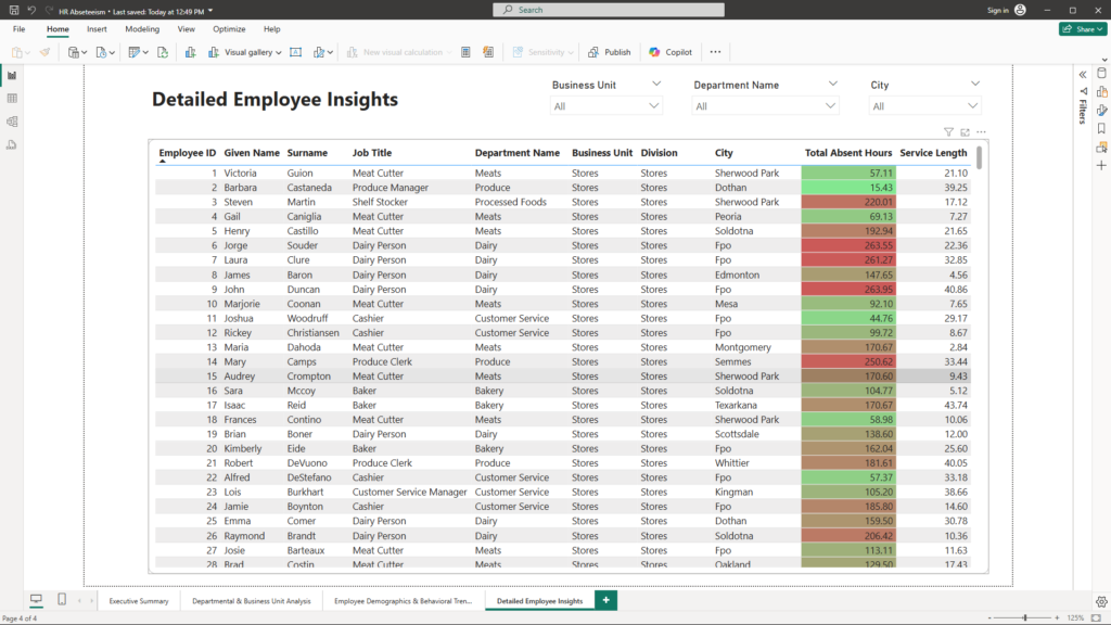
Visualizations & Benefits:
- Table Visual – Detailed Employee Absenteeism:
This interactive table lists key details like Employee ID, Name, Job Title, Department, and Absent Hours. Conditional formatting highlights employees with unusually high absenteeism. Business Impact: Such detailed insights allow HR and management to drill down into individual cases, facilitating proactive engagement and corrective actions.
Conclusion
This Power BI multi-page report is a strategic tool designed to transform raw absenteeism data into actionable insights. By leveraging intuitive visualizations—from high-level KPI cards to detailed employee tables—business leaders can quickly identify problem areas and seize opportunities to improve workforce productivity. The interactive nature of the dashboard ensures that decision-makers have real-time access to the data they need to drive strategic initiatives.
If you’re looking to harness the power of data analytics to transform your business insights and drive performance improvements, let’s connect. Reach out to me at mail@ssghosal.com and let’s explore how data can become your most powerful business asset.