Introduction
In today’s competitive healthcare landscape, every decision can significantly impact patient outcomes and operational efficiency. Many hospitals sit on vast amounts of data but struggle to transform it into actionable insights. In this case study, I demonstrate how I used Power BI to analyze six years of hospital data to create a multipage, interactive report. This report not only highlights key performance metrics but also reveals hidden trends and opportunities, enabling business leaders to make strategic, data-driven decisions.
Problem Statement
Hospitals face multifaceted challenges:
- Patient Trends: Variations in patient admissions and evolving demographics make staffing and resource planning difficult.
- Financial Performance: Diverse revenue streams, complex insurance dynamics, and billing discrepancies hinder profitability.
- Operational Efficiency: Bottlenecks in patient flow and resource utilization strain hospital operations.
- Provider Performance: Inconsistent quality of care across departments complicates performance benchmarking.
- Clinical Insights: Without clear visibility into prevalent medical conditions and treatment outcomes, optimizing clinical strategies remains a guessing game.
Without a centralized, interactive dashboard, decision-makers rely on fragmented data, delaying strategic interventions and process improvements.
The Solution: A Multipage Power BI Report
I developed a comprehensive Power BI report that spans six detailed sections. Each report is designed to reveal critical insights while focusing on the outcomes that matter most to business leaders. Here’s an in-depth look at each report, its visualizations, and the business benefits they deliver.
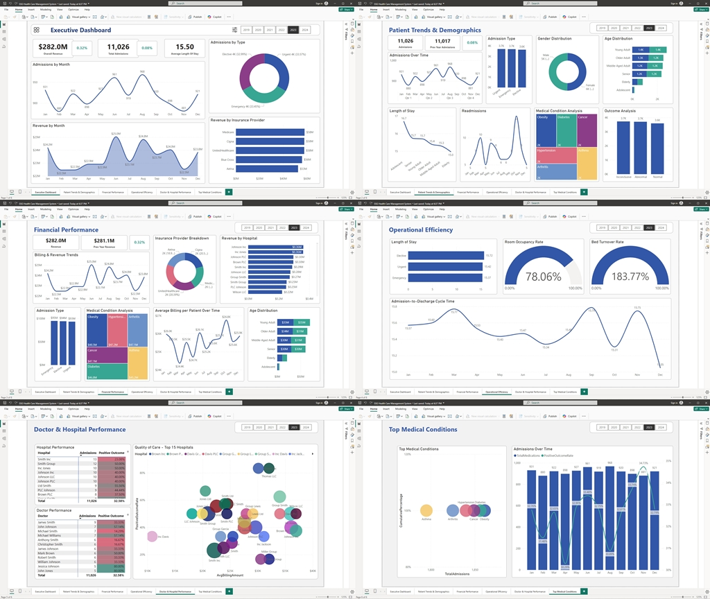
1. Executive Summary
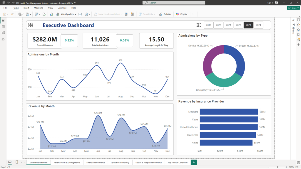
Visualizations & Setup:
- Top-Line KPIs:
Card visuals display key metrics such as total admissions, overall revenue, average length of stay, and critical demographic statistics. - Trend Charts:
- A Line/Area Chart shows monthly admissions trends, instantly revealing seasonal peaks and troughs.
- A Donut/Bar Chart presents the breakdown of admission types (Emergency, Elective, Urgent), offering a clear picture of service mix.
- Operational Metrics:
Gauges and scorecards provide real-time snapshots of room occupancy and resource utilization.
Business Benefits:
- Instant Clarity: Executives receive a high-level snapshot of overall hospital performance at a glance.
- Quick Decision-Making: Immediate visual cues help identify trends or anomalies, prompting further investigation when needed.
- Actionable Insights: Drill-down capabilities allow leaders to explore specific areas of concern, enabling targeted strategic actions.
2. Patient Trends & Demographics
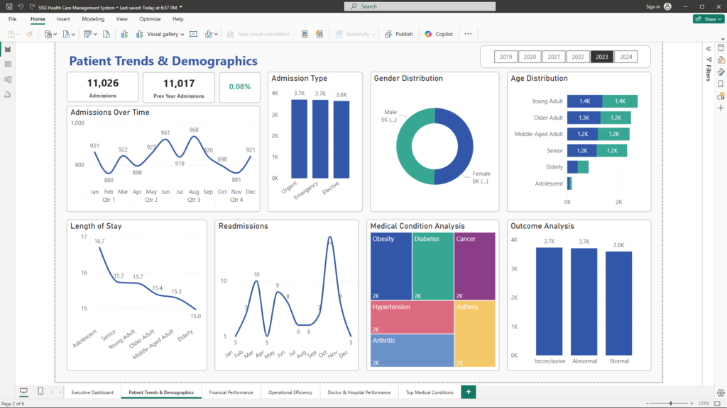
Visualizations & Setup:
- Admissions Over Time:
A Line/Area Chart displays monthly or quarterly admission counts, highlighting seasonal trends and sudden shifts. - Admission Type Breakdown:
A Stacked Bar or Donut Chart reveals the proportions of Emergency, Elective, and Urgent admissions, clarifying patient acuity and demand. - Demographic Profiles:
Histograms and heat maps illustrate age and gender distributions, supplemented by metrics like average age and gender ratios.
Business Benefits:
- Targeted Resource Planning: Insights into patient demographics and admission patterns help optimize staffing, service design, and resource allocation.
- Enhanced Patient Experience: Understanding patient profiles enables tailored service offerings, improving overall satisfaction.
- Proactive Management: Early identification of trends (such as a surge in a specific age group) facilitates timely adjustments to service delivery.
3. Financial Performance
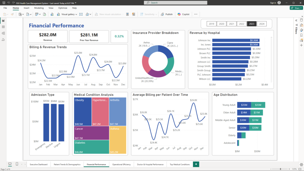
Visualizations & Setup:
- Billing & Revenue Trends:
A Line Chart tracks revenue trends over time, highlighting both total billing amounts and average billing per patient. - Insurance Provider Breakdown:
A Pie or Bar Chart breaks down revenue contributions by insurance provider (e.g., Medicare, Blue Cross), providing insight into payer mix. - Billing Amount Distribution Analysis:
A Histogram or Box Plot displays the distribution of billing amounts, exposing outliers that may indicate underbilling or overbilling. - Trends in Average Billing per Patient:
Another Line Chart monitors changes in average billing per patient over time, signaling shifts in service mix or pricing strategy.
Business Benefits:
- Revenue Optimization: Pinpointing high- and low-performing revenue streams supports refined billing practices and pricing strategies.
- Improved Payer Mix: Insights into insurance provider contributions enable better negotiations and revenue management.
- Enhanced Financial Strategy: Identifying billing anomalies prompts corrective actions, ensuring consistent revenue streams.
4. Operational Efficiency
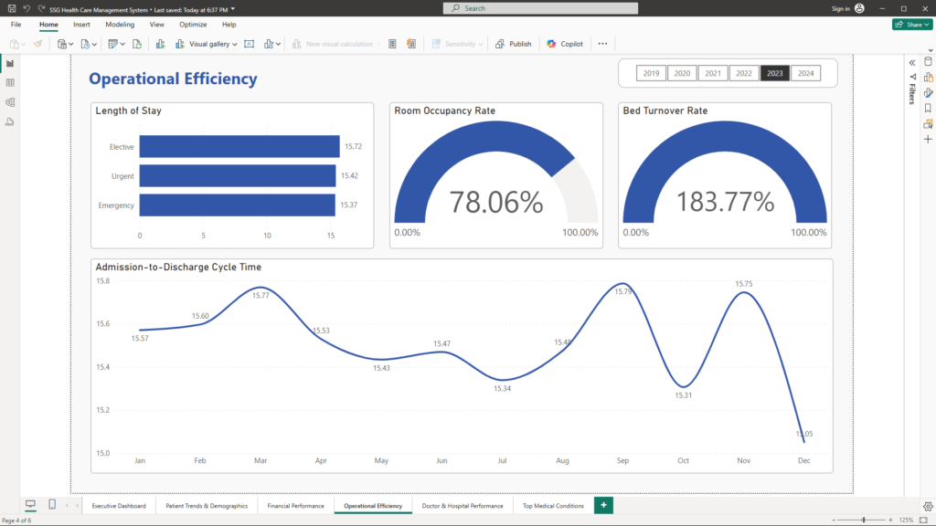
Visualizations & Setup:
- Length of Stay Analysis:
A Bar Chart or Box Plot compares average length of stay by admission type or medical condition, revealing operational bottlenecks. - Room & Resource Utilization:
- Gauge/Heat Map: Provides a real-time look at room occupancy rates and resource usage.
- Additional Metrics: KPI cards display the bed turnover rate, while idle time analysis highlights inefficiencies in room scheduling.
- Cycle Time & Wait Times:
Line or Bar Charts track the admission-to-discharge cycle and service wait times, offering insights into overall patient flow.
Business Benefits:
- Operational Optimization: Identifies delays and inefficiencies, guiding process improvements and resource reallocation.
- Cost Reduction: Reducing idle time and optimizing staff allocation lowers operational costs.
- Enhanced Patient Satisfaction: Streamlined processes lead to shorter wait times and improved patient care experiences.
5. Doctor & Hospital Performance
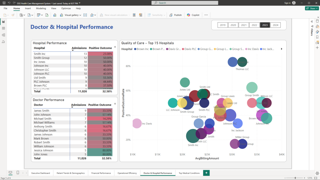
Visualizations & Setup:
- Provider Performance:
- Bar Charts and Ranking Tables: Display admission counts and outcome percentages by doctor and hospital, enabling clear performance comparisons.
- Combo Charts: Combine bar and line visuals to juxtapose volume and quality metrics, highlighting providers with high admissions but lower outcome rates.
- Quality of Care Indicators:
- Scatter Plots: Correlate billing amounts with patient outcomes, offering a nuanced view of financial efficiency relative to care quality.
- Additional Metrics:
Readmission rates (if available) further highlight areas needing attention.
Business Benefits:
- Performance Benchmarking: Easily identify high-performing providers and spotlight those needing improvement.
- Quality Assurance: Correlate financial data with clinical outcomes to drive quality enhancements.
- Strategic Resource Allocation: Inform decisions on training, staffing, and process improvements based on detailed performance data.
6. Clinical Insights
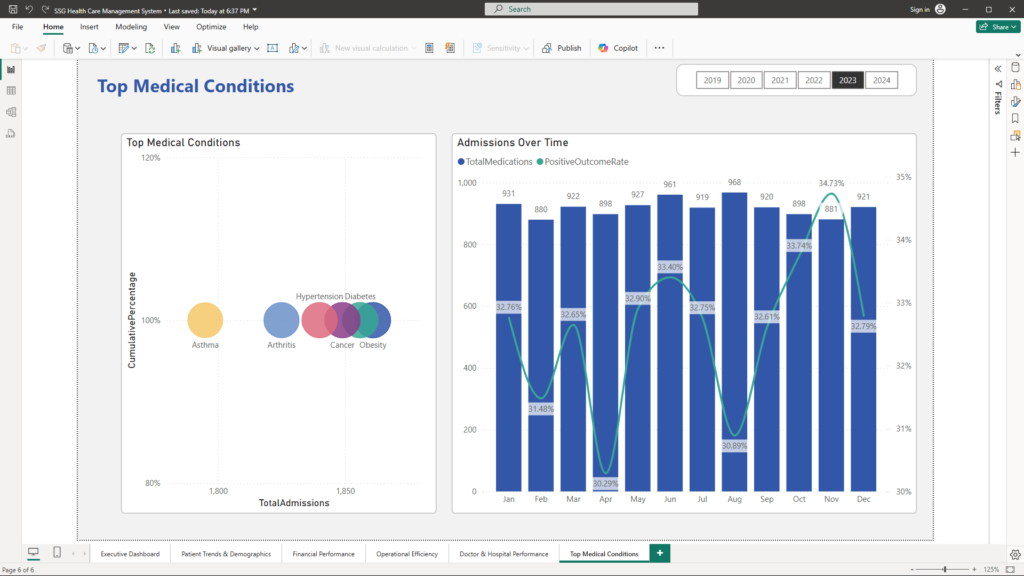
Visualizations & Setup:
- Top Medical Conditions:
A Pareto Chart or Ranked Bar Chart lists the most common medical conditions (e.g., Cancer, Diabetes) along with their frequency and impact on overall admissions. - Medication & Test Results:
A Dual-Axis Chart simultaneously displays trends in prescribed medications and the distribution of test results (Normal, Abnormal, Inconclusive) over time. - Additional Insights:
Cumulative analysis of conditions and correlation analysis between medication usage and outcomes further enrich the narrative.
Business Benefits:
- Targeted Clinical Interventions: Identify prevalent conditions to focus preventive measures and improve treatment protocols.
- Optimized Resource Allocation: Align medication and clinical resource supply with actual patient needs.
- Informed Strategic Planning: Use clinical insights to prioritize initiatives that enhance patient outcomes and reduce costs.
Conclusion
This comprehensive multipage Power BI report transforms raw hospital data into actionable, visually compelling insights. By integrating detailed analyses of patient trends, financial performance, operational efficiency, provider performance, and clinical insights, the report empowers business leaders to make strategic, informed decisions that drive growth, improve patient care, and optimize operations.
This case study exemplifies how leveraging advanced data analytics can reveal hidden opportunities and pinpoint areas for improvement—even in the complex environment of healthcare.
Unlock the power of your data and transform your operations. For more insights and to discuss how I can help you leverage data analytics to revolutionize your business, please contact me at mail@ssghosal.com.