Introduction
In today’s data-driven world, hospital operations and patient care rely heavily on real-time insights and performance metrics. The Hospital ER Analysis case study showcases how data analysis can transform emergency room management by providing deep insights into patient flow, operational efficiency, and quality of care. By harnessing the power of data, hospitals can identify critical areas that need improvement, optimize resource allocation, and ultimately enhance the patient experience.
Problem Statement
Hospital emergency rooms often face challenges such as prolonged wait times, inconsistent patient satisfaction, and inefficiencies in resource allocation. Without accurate, timely data, decision-makers struggle to pinpoint the root causes of these issues and deploy effective solutions. The lack of comprehensive dashboards and analytical reports can lead to missed opportunities in improving care quality and operational performance.
Data-Driven Solutions
Through a structured approach to data analysis, hospitals can address these challenges by:
- Monitoring KPIs: Using real-time dashboards to track key performance indicators (KPIs) such as total patients, admissions, average wait times, and patient satisfaction.
- Identifying Trends: Analyzing trends over time to uncover seasonal patterns or operational bottlenecks.
- Segmenting Patient Profiles: Breaking down patient demographics to understand different needs and outcomes.
- Departmental Insights: Comparing performance across departments to highlight areas requiring process improvements.
- Targeted Interventions: Using insights from care management and feedback completeness to improve patient engagement and resource allocation.
The following sections outline four comprehensive Power BI reports designed to empower hospital management with actionable insights.
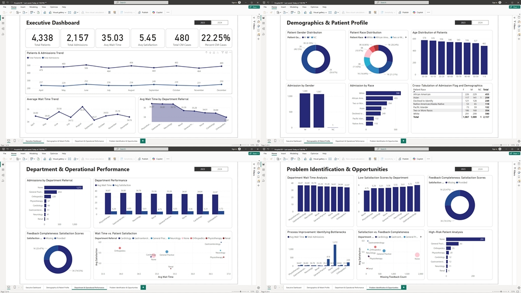
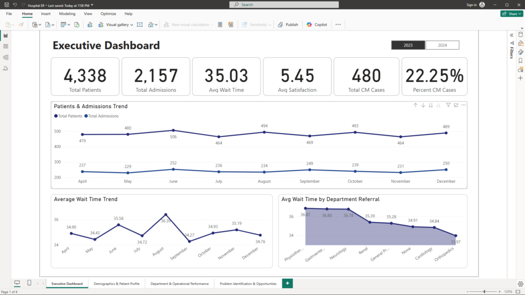
Report 1: Executive Dashboard
Purpose:
Provide a high-level overview of hospital operations, track performance metrics, and identify key trends.
Visualizations:
- KPIs & Summary Cards:
- Total Patients: Displays the total count of patients in the system.
- Total Admissions: Shows the total number of admissions.
- Average Wait Time: Overall wait time across admissions.
- Average Satisfaction: Mean patient satisfaction score with alerts for underperformance.
- Total CM Cases: Count of patients flagged for care management.
- Percent CM Cases: Percentage of admissions flagged for care management.
- Patients & Admissions Trend (Line Chart):
- Visualizes the trend in patient arrivals and admissions over time.
- Average Wait Time Trend (Line Chart):
- Displays the evolution of average wait times over different time periods, identifying peak congestion periods.
- Avg Wait Time by Department Referral (Area Chart):
- Compares average wait times across various department referrals to highlight operational bottlenecks.
Report 2: Demographics & Patient Profile
Purpose:
Delve into the composition of the patient population, providing insights into demographics and admission patterns.
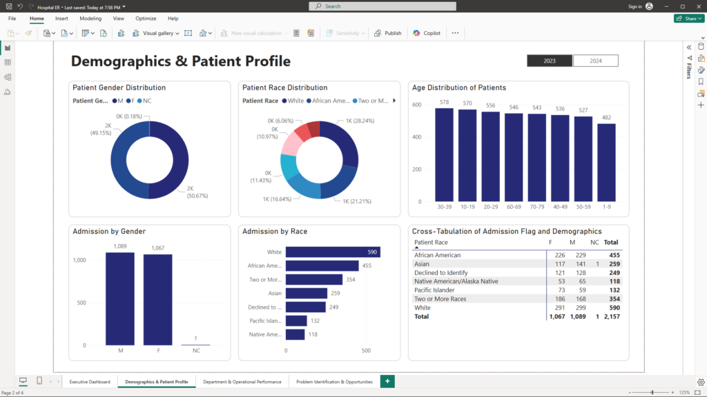
Visualizations:
- Patient Gender Distribution (Donut Chart):
- Illustrates the proportion of male and female patients.
- Patient Race Distribution (Donut Chart):
- Visualizes the racial makeup of the patient population.
- Age Distribution of Patients (Column Chart):
- Displays the distribution of patients across different age groups.
- Admission by Gender (Column Chart):
- Breaks down admissions by gender to uncover potential disparities.
- Admission by Race (Bar Chart):
- Compares admission rates across different racial groups.
- Cross-Tabulation of Admission Flag and Demographics (Matrix):
- Provides a detailed view of how admission flags (e.g., emergency vs. non-emergency) distribute across gender and race demographics.
Report 3: Department & Operational Performance
Purpose:
Focus on operational metrics and departmental performance, helping managers to identify inefficiencies and optimize service delivery.
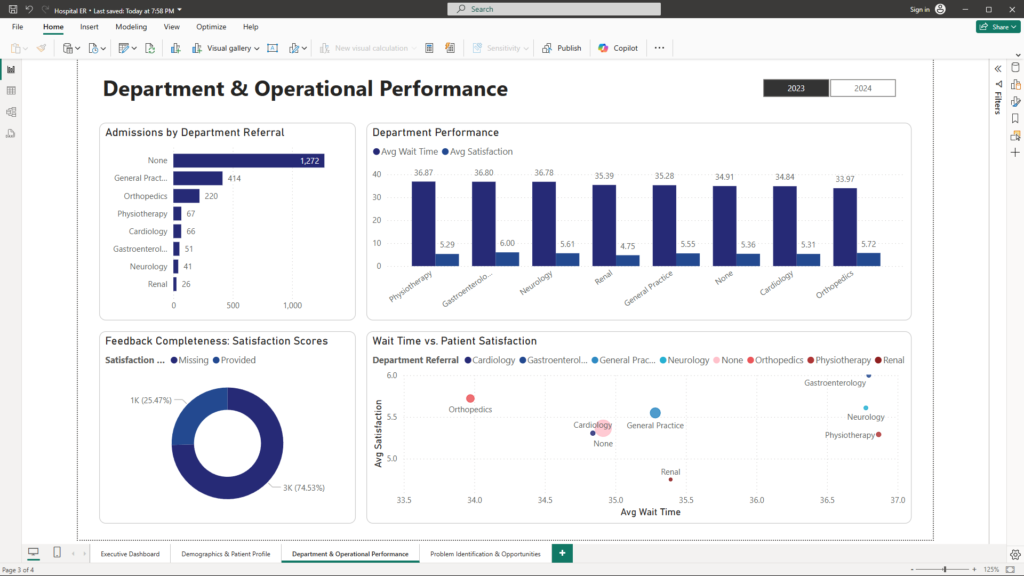
Visualizations:
- Admissions by Department Referral (Bar Chart):
- Compares the number of admissions across different departments to highlight areas with high patient volumes.
- Department Performance (Stacked Column Chart):
- Displays average wait times and satisfaction scores by department, facilitating side-by-side comparisons.
- Feedback Completeness: Satisfaction Scores (Donut Chart):
- Visualizes the completeness of patient feedback by showing the proportion of provided versus missing satisfaction scores.
- Wait Time vs. Patient Satisfaction (Scatter Plot):
- Correlates patient wait times with satisfaction scores to identify potential service issues where longer waits may be lowering satisfaction.
Report 4: Problem Identification & Opportunities
Purpose:
Identify problem areas and uncover opportunities for improvement in hospital operations and patient care.
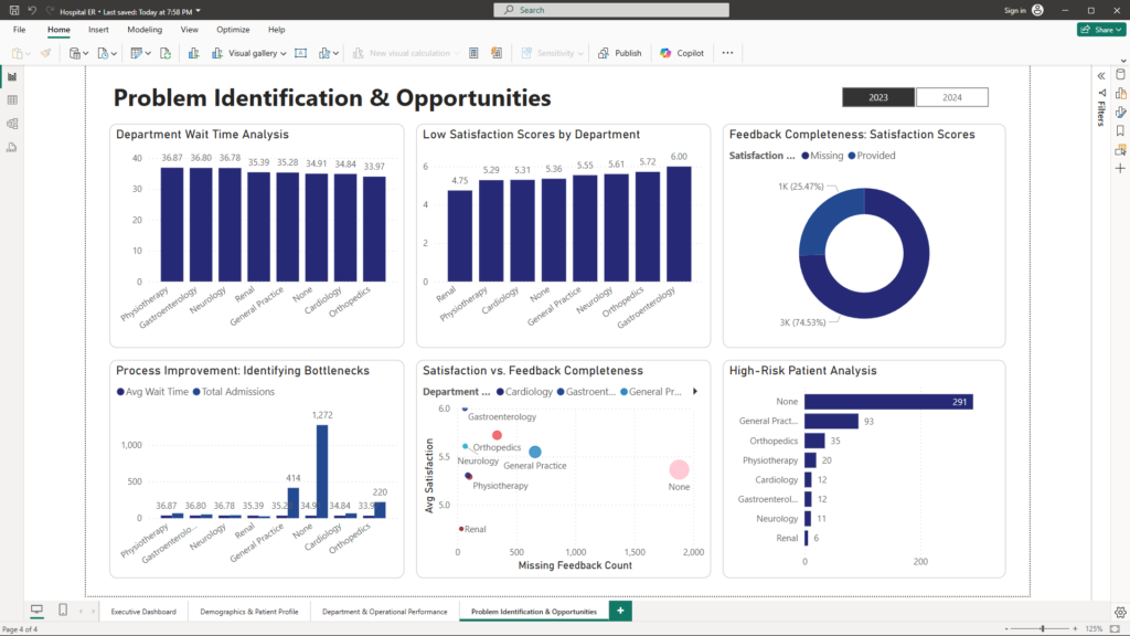
Visualizations:
- Department Wait Time Analysis (Column Chart):
- Highlights departments with significantly longer wait times, pinpointing potential bottlenecks.
- Low Satisfaction Scores by Department (Column Chart):
- Flags departments where patient satisfaction is below target levels, indicating areas for quality improvement.
- Feedback Completeness: Satisfaction Scores (Donut Chart):
- Provides an overview of the proportion of missing satisfaction feedback, critical for accurate performance measurement.
- Feedback Completeness: Satisfaction Scores (Clustered Column Chart):
- Offers a detailed breakdown of missing versus provided feedback across departments.
- Satisfaction vs. Feedback Completeness (Scatter Plot):
- Analyzes the relationship between patient satisfaction and the completeness of feedback, revealing opportunities for enhanced patient engagement.
- High-Risk Patient Analysis (Bar Chart):
- Focuses on patients flagged for care management (Patients CM), helping to identify high-risk groups that may require targeted interventions.
Conclusion
The Hospital ER Analysis case study demonstrates how data analysis and visualization can drive transformative improvements in hospital operations. By leveraging detailed dashboards and interactive reports, hospital management can quickly identify problem areas such as high wait times, low satisfaction scores, and incomplete patient feedback. At the same time, these insights open up opportunities for process improvement, enhanced patient engagement, and targeted care management.
For more information on how to harness the power of data to improve hospital performance, feel free to reach out at mail@ssghosal.com. Embrace data-driven decision making and drive your hospital towards operational excellence and superior patient care.