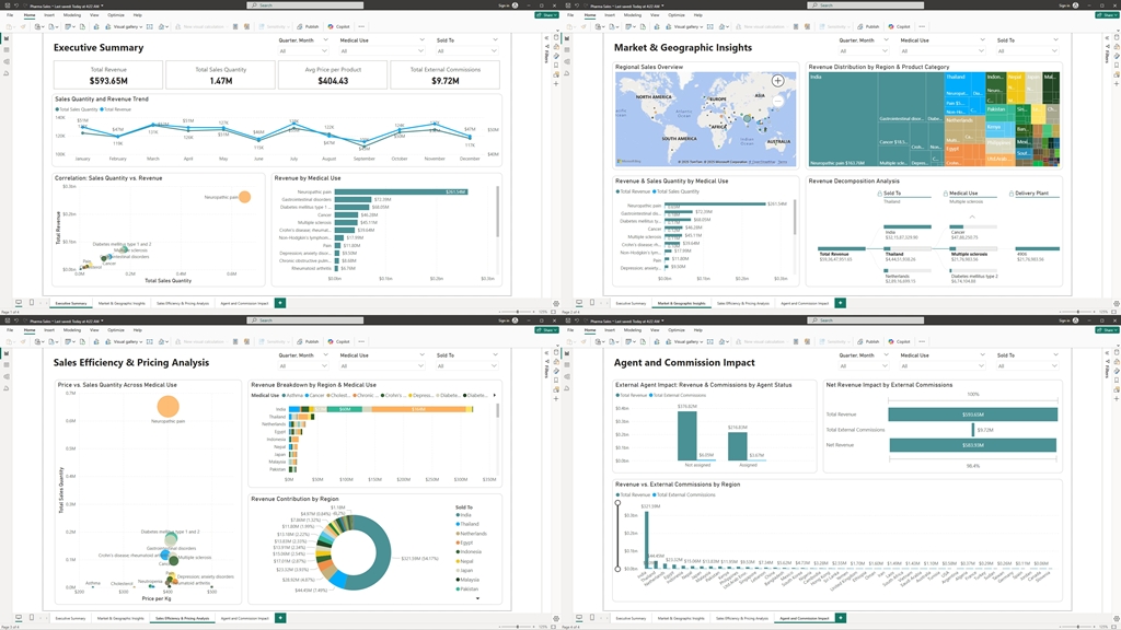
In today’s highly competitive business landscape, the ability to transform raw data into actionable insights is a key driver of success. Organizations that harness the power of data analytics not only stay ahead of market trends but also make proactive decisions that significantly enhance their competitive edge. In this case study, I illustrate how a comprehensive Power BI dashboard was developed using sales data to deliver a 360° view of business performance.
By integrating multiple interactive reports and visualizations, the dashboard empowers top management with real-time insights, enabling them to pinpoint opportunities, streamline operations, and address challenges swiftly. This article outlines the various components of the dashboard—from high-level overviews to detailed profitability analysis—demonstrating not only my deep expertise in data analysis but also the tangible business value of harnessing advanced analytics tools.
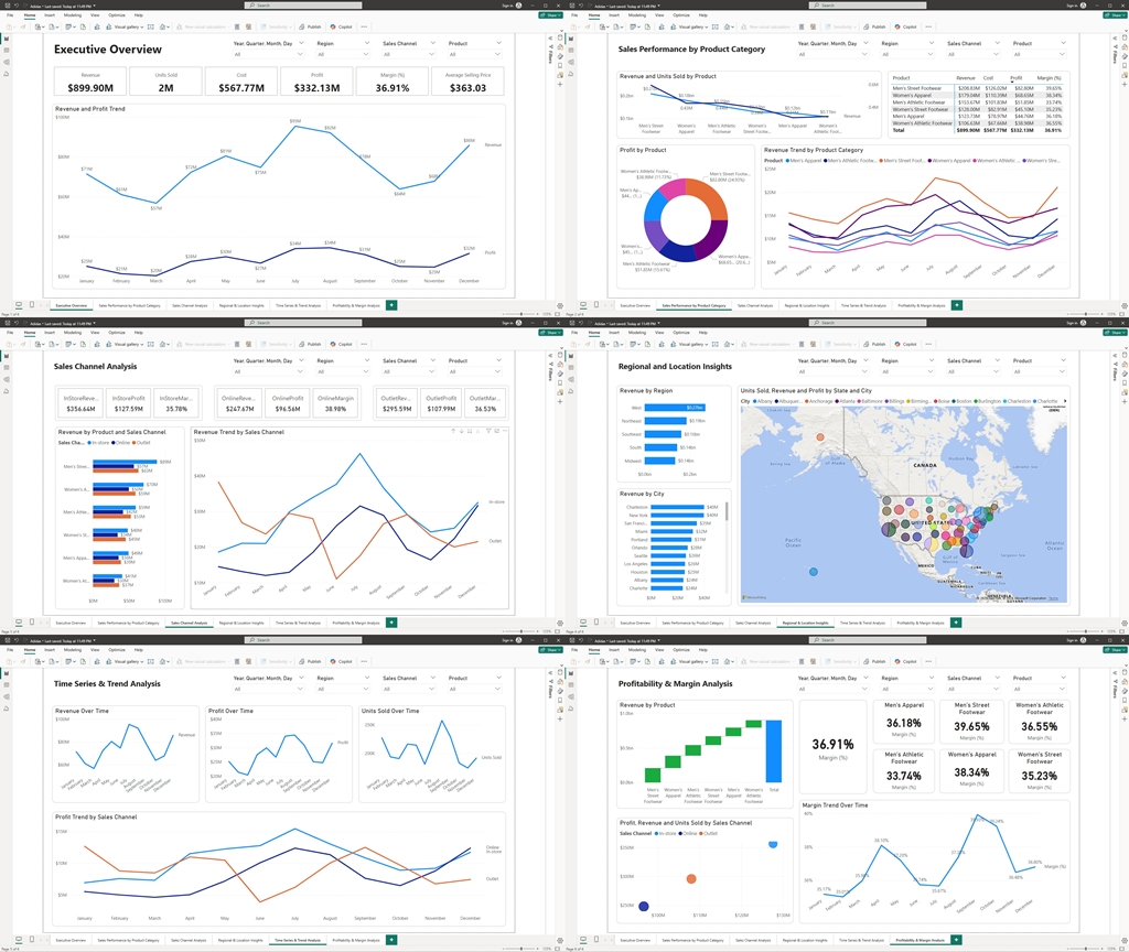
1. Executive Overview
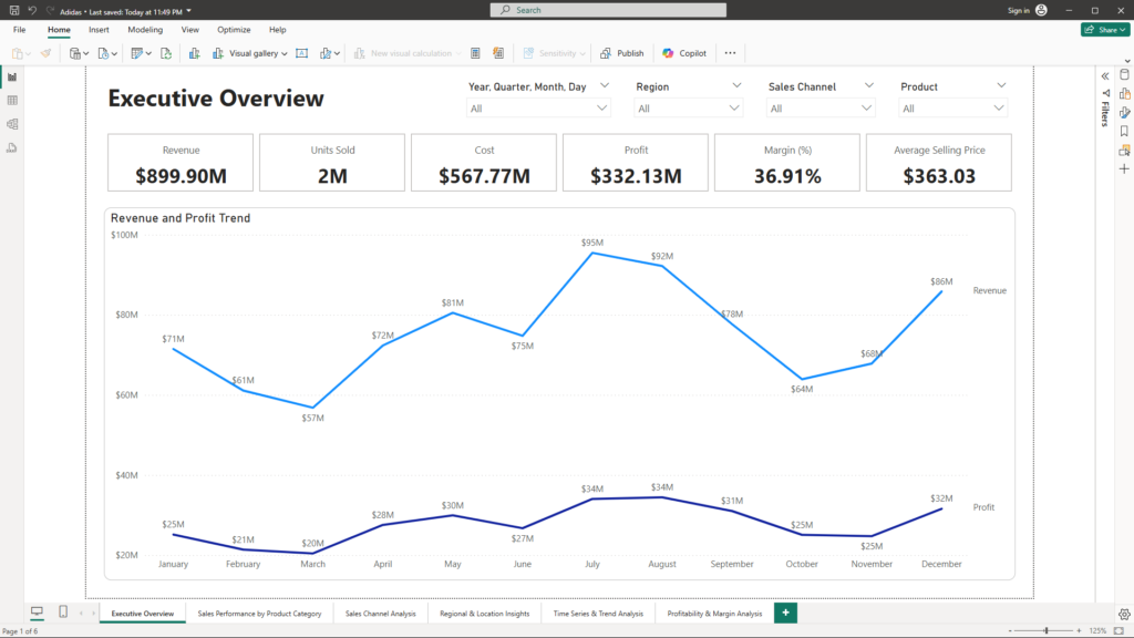
Purpose: Deliver a high-level snapshot of overall sales performance.
Visuals:
- KPI Cards: Present key metrics such as Total Revenue, Total Units Sold, Total Profit, Overall Gross Margin (%), and Average Selling Price.
- Time Series Chart: A dynamic line/area chart illustrates revenue trends over time, enabling quick identification of growth patterns and seasonal fluctuations.
Benefits Summary:
- Quick Decision-Making: The executive overview provides an at-a-glance view of key performance indicators, allowing leadership to assess the health of the business rapidly.
- Strategic Insights: By visualizing trends and patterns, management can quickly identify growth opportunities and potential areas of concern.
2. Sales Performance by Product Category
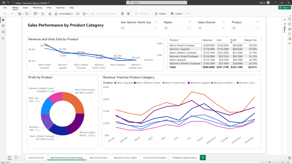
Purpose: Identify which product lines are excelling and which need attention.
Visuals:
- Bar/Column Charts: Compare revenue and units sold across product categories such as Men’s Street Footwear, Women’s Apparel, and more.
- Pie/Donut Charts: Illustrate the revenue or profit share each product category contributes, making it easy to spot key contributors.
- Detailed Table/Matrix: Provides granular metrics (revenue, cost, profit, margin) with drill-through capabilities for deeper exploration.
Benefits Summary:
- Targeted Analysis: Managers can pinpoint high-performing product lines and quickly identify underperformers for strategic adjustments.
- Actionable Insights: The drill-through functionality allows for deeper exploration into specific metrics, supporting data-driven decisions for product management.
3. Sales Channel Analysis
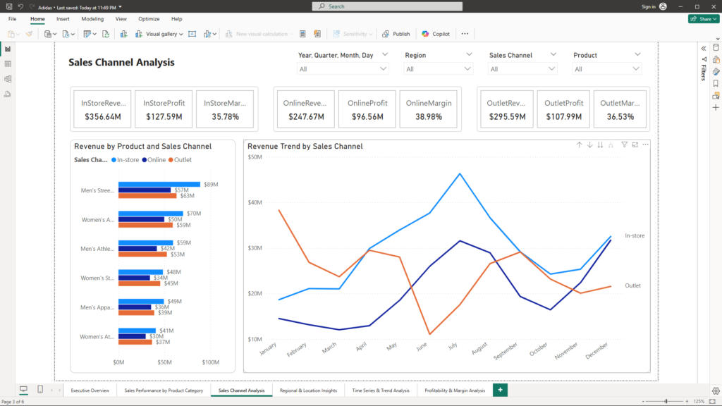
Purpose: Understand performance differences between channels (e.g., In-store vs. Outlet)
Visuals:
- Channel-Specific KPI Cards: Dedicated cards, such as “In-Store Revenue” and “Outlet Profit,” present channel-specific performance metrics.
- Stacked Bar/Clustered Column Charts: Enable side-by-side comparisons across channels and product categories.
- Trend Line Chart: Captures how channel performance evolves over time, helping to identify emerging trends or areas of concern.
Benefits Summary:
- Channel Optimization: By comparing channels directly, leaders can allocate resources more effectively and optimize marketing strategies.
- Trend Identification: Ongoing monitoring of channel trends helps in early detection of shifts in consumer behavior or channel performance issues.
4. Regional and Location Insights
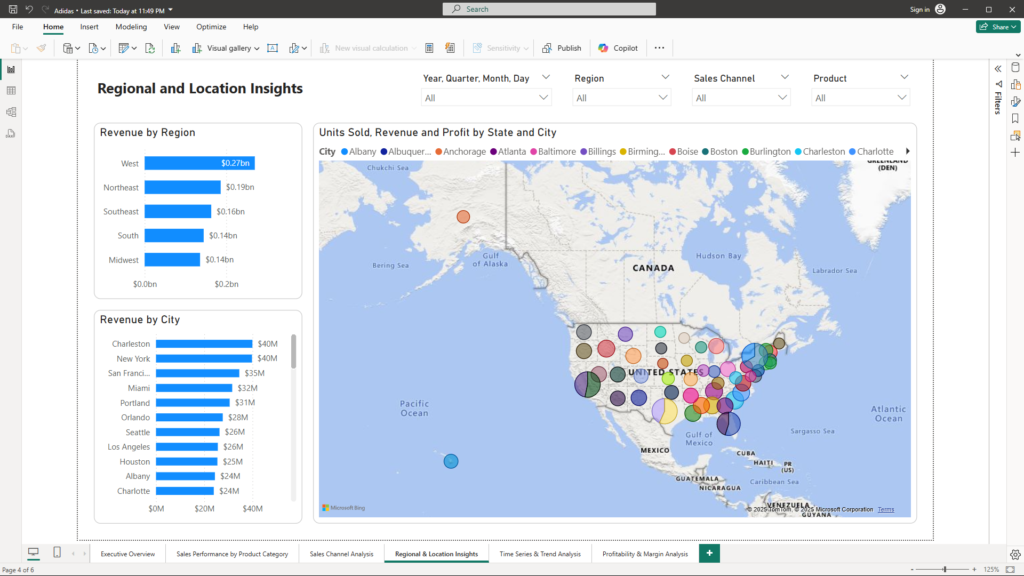
Purpose: Uncover geographical trends to identify regional opportunities or challenges.
Visuals:
- Geographical Map: Plots sales performance by region and city, making it easy to pinpoint areas of strength or underperformance.
- Location-Based Bar Charts: Compare revenue and units sold by store or city, offering localized insights and actionable intelligence.
- Drill-Down Capabilities: Enable users to click on a region for a detailed local performance view.
Benefits Summary:
- Localized Strategy: Regional insights support targeted decision-making for market expansion or localized promotions.
- Actionable Intelligence: Identifying performance gaps by location enables swift corrective actions and resource reallocation.
5. Detailed Time Series and Trend Analysis
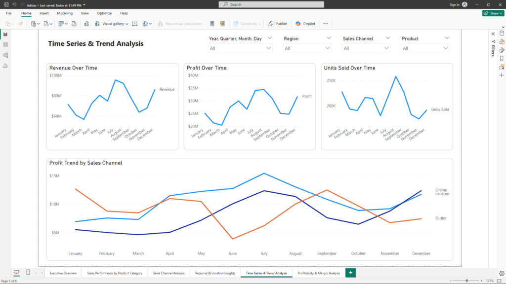
Purpose: Provide granular insights into sales trends and identify anomalies for proactive management.
Visuals:
- Multiple Time Series Charts: Separate line/area charts for revenue, units sold, and profit, each offering a detailed look at performance over time.
- Comparative Trend Analysis: Overlays trends by product category or sales channel, exposing seasonal peaks, troughs, and performance anomalies.
- Annotations: Key events such as promotional periods are highlighted on the charts, directly linking events to performance shifts.
Benefits Summary:
- Proactive Management: In-depth trend analysis enables managers to detect anomalies and respond proactively to market changes.
- Performance Correlation: Annotations help correlate specific events with performance shifts, improving the understanding of causality and impact.
6. Profitability and Margin Analysis
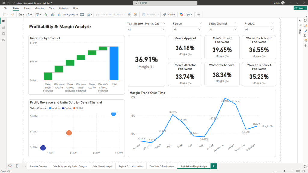
Purpose: Assess profitability in detail to pinpoint high-cost areas and low-margin products.
Visuals:
- Waterfall Chart: Visualizes the flow from revenue to profit, clearly breaking down how costs impact overall margins.
- KPI Cards for Margin: Displays both the Overall Margin (%) and margin by specific product categories, allowing for quick comparisons.
- Scatter/Bubble Charts: Compare products or channels on the basis of profit versus sales volume, highlighting opportunities to optimize cost structures.
- Margin Trend Line Chart: Tracks how margins evolve over time, providing insights into long-term profitability trends.
- Interactive Drill-Downs: Allow management to click on specific products or channels to explore detailed cost and revenue breakdowns.
Benefits Summary:
- Cost Optimization: Detailed margin analysis helps identify inefficiencies and supports initiatives to reduce costs.
- Profit Enhancement: By comparing profit against sales volume, leaders can identify high-impact areas for strategic focus and improved profitability.
Interactivity That Drives Insight
The dashboard features intuitive slicers for Date, Region, Sales Channel, and Product. This interactivity transforms the dashboard from a static report into a dynamic analytical tool, enabling business leaders to:
- Quickly isolate specific time periods for targeted analysis.
- Focus on regional or channel-specific performance.
- Drill down into product-specific details effortlessly.
Conclusion
This Power BI dashboard is a comprehensive data story that turns complex sales data into actionable insights. By integrating detailed visualizations and interactive features, business leaders gain a clear, real-time view into sales performance, product success, channel efficiency, geographical trends, and profitability. This holistic approach enables swift, informed decisions that drive strategic growth.
If you’re ready to transform your data into a strategic asset and gain a competitive edge, I invite you to connect with me at mail@ssghosal.com.