Introduction
In today’s competitive business environment, customer complaints are more than just negative feedback—they are a goldmine of actionable insights. By understanding and addressing the root causes of complaints, companies can improve service quality, optimize processes, and enhance customer satisfaction. In this article, I present an in-depth analysis of customer complaint data using Power BI, showcasing how advanced data analytics and visualization can drive strategic decision-making and help businesses overcome common operational challenges.
Problem Statement
Customer complaint data is often unstructured and voluminous, making it challenging to identify key trends, operational inefficiencies, and areas for improvement. Without a systematic approach to analyzing this data, businesses struggle to pinpoint recurring issues and implement timely resolutions. The primary challenges include:
- High Volume & Unstructured Data: Managing thousands of complaint records that vary in format and content.
- Lack of Visibility: Inability to quickly identify recurring issues or geographical hotspots.
- Delayed Response & Resolution: Difficulty in tracking response times and assessing the effectiveness of resolution strategies.
The Power BI Dashboard Solution
Our solution is to develop a suite of Power BI dashboards that transform raw customer complaint data into actionable insights. These dashboards simplify complex data with visualizations like KPI cards, trend charts, and heat maps, enabling business leaders to monitor performance, identify trends, and make informed decisions.
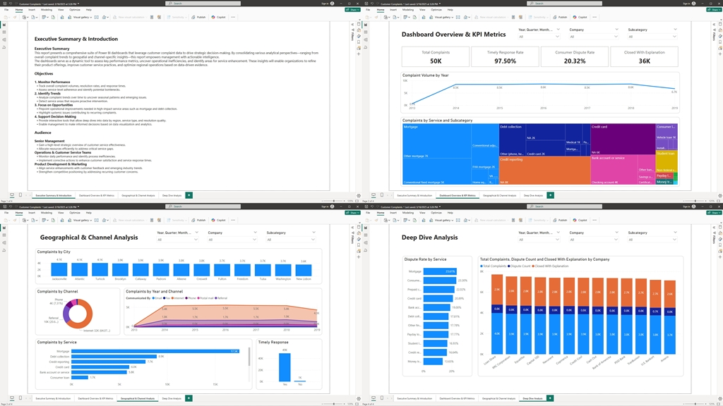
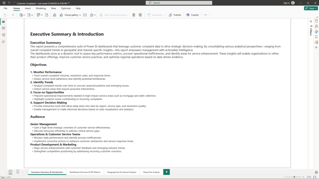
Page 1: Executive Summary & Introduction
Visualizations & Layout
- Title Section: A large, bold text box displaying “Executive Summary & Introduction” to set the tone.
- Text Boxes: Dedicated areas for the Executive Summary, Objectives, and Audience sections.
- KPI Cards (Optional): High-level metrics can be embedded to give an immediate snapshot of performance if desired.
Content
- Executive Summary:
“This report presents a comprehensive suite of Power BI dashboards that leverage customer complaint data to drive strategic decision-making. By consolidating various analytical perspectives—ranging from overall complaint trends to geospatial and channel-specific insights—this report empowers management with actionable intelligence. These insights enable organizations to refine product offerings, improve customer service practices, and optimize regional operations.” - Objectives:
- Monitor Performance: Track complaint volumes, resolution rates, and timeliness.
- Identify Trends: Uncover seasonal patterns and emerging issues.
- Focus on Opportunities: Highlight areas needing operational improvements, particularly in high-impact service areas like mortgage and debt collection.
- Support Decision-Making: Provide interactive tools to drill down into data by region, service type, and resolution quality.
- Audience:
- Senior Management: For strategic oversight and resource allocation.
- Operations & Customer Service Teams: To monitor daily performance and process inefficiencies.
- Product Development & Marketing: To align service improvements with customer feedback and competitive positioning.
Business Benefits
- Holistic Overview: Sets a clear roadmap and context for the entire analysis, ensuring all stakeholders understand the key challenges and objectives from the start.
- Alignment with Strategy: The well-defined objectives help focus on areas that matter most to business leaders, facilitating efficient resource allocation.
- Enhanced Communication: Clear articulation of audience-specific benefits ensures that each stakeholder group can extract the insights most relevant to them.
Page 2: Dashboard Overview & KPI Metrics
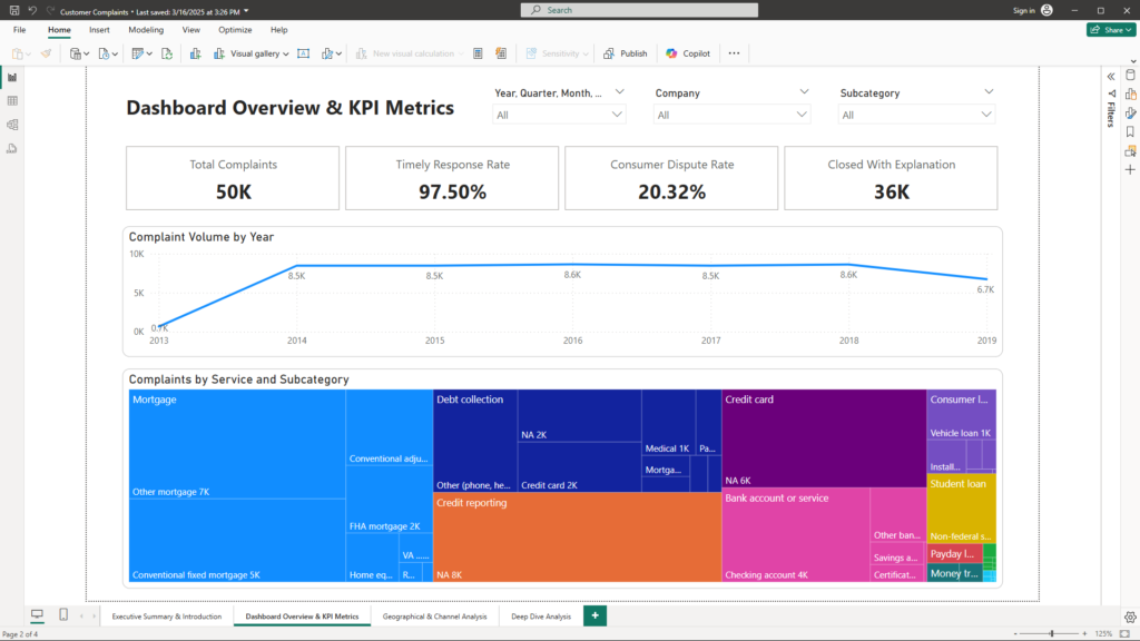
Visualizations & Layout
- KPI Cards: Display key metrics such as Total Complaints, Timely Response Rate, Resolution Outcome, and Consumer Dispute Rate. These are positioned at the top for a quick performance snapshot.
- Trend Indicators: Use line or area charts to depict complaint volumes over time.
- Interactive Filters: Slicers for date, category, or other dimensions to allow users to drill into specific segments.
Content
- Executive Summary Dashboard:
- KPIs:
- Total Complaints: Overall volume of customer complaints.
- Timely Response Rate: Percentage of responses that were timely.
- Resolution Outcome: Distribution of responses (e.g., closed with explanation, monetary relief).
- Consumer Dispute Rate: Proportion of complaints that remain disputed.
- KPIs:
- Trend Analysis Dashboard:
- Visualizations:
- Time Series Charts: Line/area charts tracking complaint volumes over time, highlighting peaks and troughs.
- Seasonal Breakdown: Filters to view data by month, quarter, or year, revealing cyclical patterns.
- Visualizations:
- Complaint Category & Subcategory Analysis:
- Visualizations:
- Treemaps: Visual representations of complaint distribution across service types and their subcategories, with drill-down features to inspect details.
- Visualizations:
Business Benefits
- Quick Performance Assessment: KPI cards and trend indicators provide an immediate understanding of how the organization is performing against key metrics.
- Data-Driven Decision Making: Interactive charts allow leaders to identify trends and adjust strategies promptly—critical for dynamic environments.
- Focused Interventions: By drilling down into complaint categories, businesses can pinpoint specific problem areas and design targeted solutions.
Page 3: Geographical & Channel Analysis
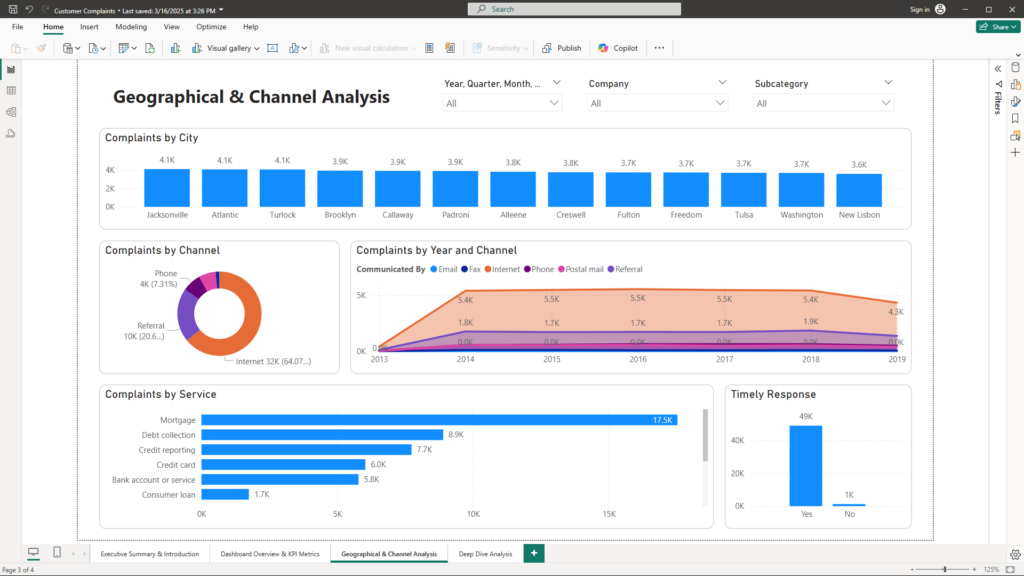
Visualizations & Layout
- Map Visuals:
- Heat Maps & Filled Maps: These maps display complaint density by City, State, and ZIP code, making it easy to identify regional hotspots.
- Communication Channel Analysis:
- Pie/Donut Charts: Visualize the breakdown of complaints by the communication channel (e.g., Internet, Phone, Referral).
- Line Charts: Show trends over time comparing digital vs. traditional communication methods.
- Interactive Filters: Enable users to filter maps and charts by region, channel, or time period.
Content
- Geographical Analysis Dashboard:
- Visual Insights: Map visuals highlight areas with high complaint concentrations, helping businesses focus on regions that need improvement.
- Communication Channel Analysis Dashboard:
- Visual Insights: Pie and line charts reveal customer preferences and trends in communication channels, which can guide resource allocation and service enhancements.
Business Benefits
- Localized Strategy: Map visuals allow companies to identify and prioritize regional issues, leading to more effective localized service improvements.
- Optimized Resource Allocation: Understanding which communication channels are most effective helps in directing support and marketing resources where they will have the most impact.
- Enhanced Customer Engagement: Insight into customer communication preferences enables companies to tailor their strategies, thereby improving overall customer experience.
Page 4: Deep Dive Analysis & Drill-Down Reports
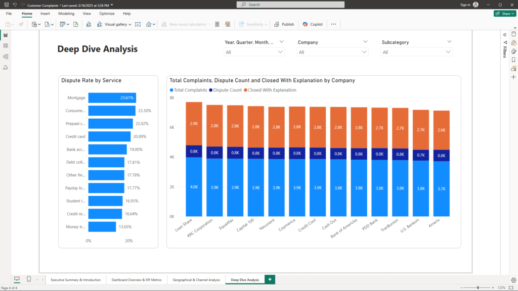
Visualizations & Layout
- Consumer Dispute Analysis Dashboard:
- Scatter/Column Charts: Offer a detailed view of dispute rates by service type and subcategory. Visual cues such as bubble size and color intensity highlight high-dispute areas.
- Company Performance Dashboard:
- Clustered Bar Charts or Matrix Visuals: Compare key metrics like timely response rate, resolution effectiveness, and dispute rates across different companies or business units.
- Drill-Down & Detailed Analysis Reports:
- Interactive Visuals: Enable drill-through features and detailed filtering, allowing users to explore specific areas (e.g., mortgage complaints broken down by sub-issue) in real time.
- Slicers and Filters: Enhance interactivity and allow for granular analysis based on date, region, or category.
Content
- Consumer Dispute Analysis Dashboard:
- Visual Insights: Identifies which service areas have the highest dispute rates, signaling potential dissatisfaction and highlighting where further investigation is needed.
- Company Performance Dashboard:
- Visual Insights: Side-by-side comparisons of performance metrics help benchmark different companies or units, fostering a culture of continuous improvement.
- Drill-Down & Detailed Analysis:
- Visual Insights: Empower operational teams to drill into detailed data, understand the root causes of recurring issues, and make informed decisions to resolve them.
Business Benefits
- Targeted Action Plans: Detailed analysis of dispute rates and company performance provides a solid basis for targeted follow-up actions and operational improvements.
- Benchmarking Excellence: Comparative visuals allow businesses to identify best practices from top-performing units and replicate their success across the organization.
- Empowered Decision-Making: Drill-down capabilities enable real-time exploration of specific problem areas, ensuring that decisions are based on detailed, accurate data.
Conclusion
Customer complaints offer a unique lens into your business operations and customer experiences. With the help of Power BI, raw data is transformed into a strategic asset that empowers you to make informed, data-driven decisions. The comprehensive dashboards not only highlight key performance metrics and trends but also provide actionable insights at a granular level—enabling rapid identification of issues and proactive interventions.
By embracing this data-driven approach, companies can enhance customer service, optimize product offerings, and improve operational efficiency. If you’re ready to turn your customer feedback into a competitive advantage, or if you have any questions about leveraging data analytics for your business, please feel free to reach out to me at mail@ssghosal.com.