Introduction
In today’s competitive business landscape, call centers play a pivotal role in shaping customer experience and driving operational efficiency. Recognizing the critical need for actionable insights, our team developed a comprehensive Power BI dashboard designed specifically for a call center environment. Leveraging synthetic data that mirrors real-world scenarios, this solution preserves client confidentiality while showcasing robust data analysis capabilities. This article outlines the problem statement, our solution approach, and the positive outcomes achieved through this dynamic reporting tool.
Problem Statement
Call center managers and senior leadership often face multifaceted challenges, including:
- Operational Efficiency: Quickly assessing call volumes, handling times, and agent performance.
- Customer Experience: Tracking customer satisfaction and ensuring prompt resolution of issues.
- Strategic Decision Making: Using historical trends to forecast future demand and optimize resource allocation.
Traditional reporting methods were labor-intensive, lacked interactivity, and failed to provide a holistic view of performance metrics. The need for a real-time, interactive dashboard that integrates diverse data sources into a coherent analytical framework was clear. Our Power BI solution was designed to answer these questions and empower decision-makers with intuitive insights and predictive trends.
Solution Overview
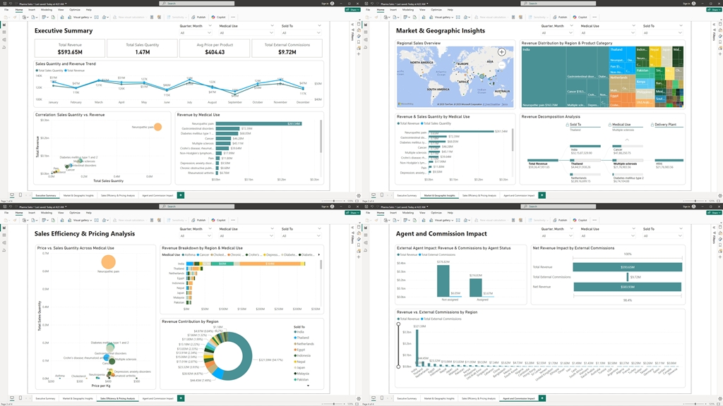
To address these challenges, we developed a multi-page Power BI dashboard that centralizes key performance indicators (KPIs) and operational metrics from call center operations. The dashboard is divided into four key sections:
1. Executive Summary
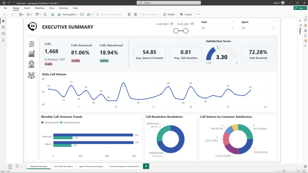
Objective: Provide a high-level view of overall call center performance.
- KPIs Displayed:
- Total Calls
- Calls Answered %
- Calls Abandoned %
- Average Speed of Answer
- Average Talk Duration
- Satisfaction Score
- Calls Resolved %
- Visualizations:
- Line Chart – Daily Call Volume: Displays the daily fluctuations in call traffic.
- Bar Chart – Monthly Call Outcome Trends: Compares answered versus abandoned calls across months.
- Donut Chart – Call Resolution Breakdown: Illustrates the proportion of calls resolved versus unresolved.
- Donut Chart – Call Volume by Customer Satisfaction: Highlights how call volumes are distributed across different satisfaction ratings.
These visuals empower senior leadership to instantly gauge overall performance and pinpoint critical areas requiring immediate intervention. By transforming raw data into intuitive, interactive dashboards, decision-makers can rapidly identify trends, uncover inefficiencies, and allocate resources strategically to optimize operations and enhance customer satisfaction. This level of real-time insight not only accelerates reaction times but also fosters a proactive culture of continuous improvement.
2. Call Trends & Analysis
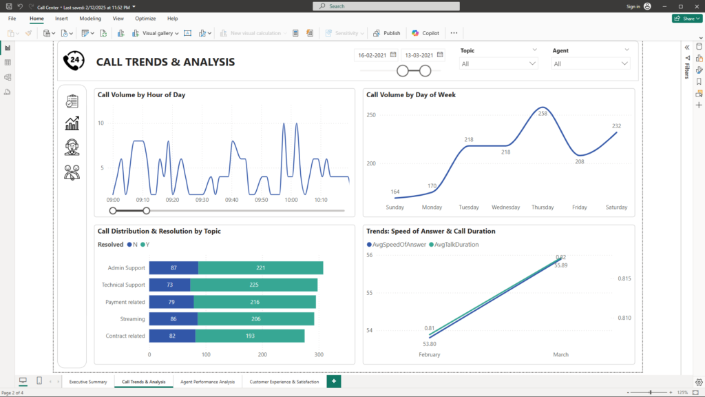
Objective: Provide insights into how calls are distributed over time and across various dimensions.
- Visualizations:
- Line Chart – Call Volume by Hour of Day: Reveals peak hours of call activity, enabling better staff scheduling.
- Line Chart – Call Volume by Day of Week: Shows trends across different weekdays to identify patterns.
- Stacked Bar Chart – Call Distribution & Resolution by Topic: Breaks down call volumes by topic while highlighting resolution rates, allowing managers to pinpoint topics that may require further process improvement.
- Line Chart – Trends: Speed of Answer & Call Duration: Plots trends in both the speed of answer and average talk duration over time, offering insights into operational efficiency improvements or issues.
This section provides managers with comprehensive, detailed temporal insights that allow them to delve deep into the dynamics of call activity across different time periods. By analyzing call patterns—such as fluctuations in volume by hour, day, or week—leaders can gain a nuanced understanding of peak demand periods and potential operational bottlenecks. This data-driven approach enables them to optimize resource allocation, ensuring that staffing, training, and support processes are strategically aligned with actual call center behavior. Ultimately, these insights pave the way for improved operational efficiency and enhanced customer satisfaction by allowing for more agile and informed decision-making.
3. Agent Performance Analysis
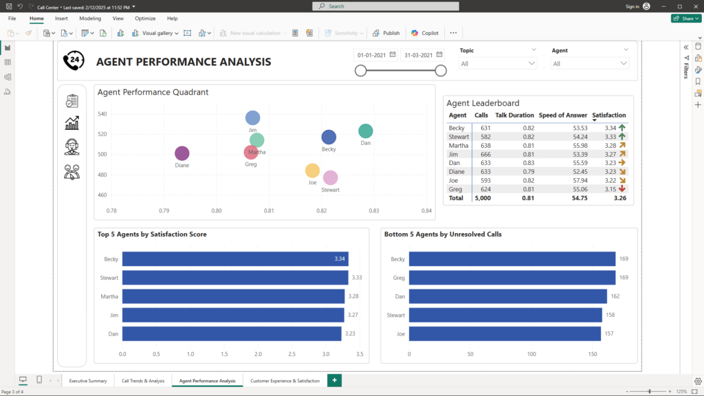
Objective: Identify top-performing agents and those requiring additional support or training.
- Visualizations:
- Scatter Plot – Agent Performance Quadrant: Compares each agent’s average talk duration (X-axis) with the number of calls answered (Y-axis), with color saturation indicating the average satisfaction score. This visualization quickly identifies which agents are performing above or below average.
- Matrix – Agent Leaderboard: Lists key performance metrics for each agent, including total calls, average talk duration, average speed of answer, and satisfaction score, allowing for detailed performance comparisons.
- Bar Chart – Top 5 Agents by Satisfaction Score: Highlights the agents with the highest satisfaction scores, showcasing excellence in customer service.
- Bar Chart – Bottom 5 Agents by Unresolved Calls: Identifies agents with the highest counts of unresolved calls, signaling potential areas for further training or process review.
These visuals foster a performance-driven culture by making individual metrics transparent and actionable. They provide a comprehensive view of each team member’s contributions, enabling managers to identify both strengths and areas needing improvement at a granular level. This transparency not only empowers employees to set and achieve targeted performance goals, but also drives accountability by offering real-time, data-backed feedback. By highlighting individual and team performance, the dashboard supports continuous improvement and strategic interventions where necessary. Ultimately, this approach aligns the entire organization around critical performance indicators, leading to enhanced productivity, improved customer satisfaction, and a stronger competitive edge in the marketplace.
4. Customer Experience & Satisfaction
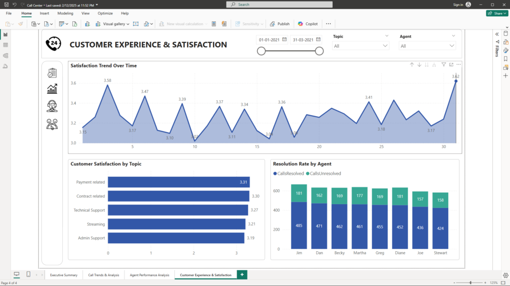
Objective: Delve into customer satisfaction trends and agent resolution performance to enhance service quality.
- Visualizations:
- Area Chart – Satisfaction Trend Over Time: Tracks changes in overall customer satisfaction, highlighting trends and potential seasonal effects.
- Bar Chart – Customer Satisfaction by Topic: Reveals which topics correlate with higher or lower customer satisfaction, enabling targeted quality improvements.
- Stacked Column Chart – Resolution Rate by Agent: Compares resolved and unresolved calls across agents, providing insights into individual performance in handling customer issues.
By continuously monitoring these metrics, the dashboard ensures that customer experience remains at the forefront of operational improvements by providing actionable insights and real-time feedback on service performance. This persistent vigilance allows leadership to detect trends, address emerging issues, and implement targeted interventions quickly, ensuring that every touchpoint in the customer journey is optimized for satisfaction. As a result, the organization is better equipped to tailor its service delivery to meet evolving customer needs, ultimately driving loyalty and fostering long-term relationships.
Enhanced Interactivity and the Power of Filtering
One of the standout features of our Power BI dashboard is its advanced interactivity. The solution includes three dedicated slicers—Date, Topic, and Agent—which allow users to dynamically filter the data to focus on specific time periods, call topics, or individual agents. Additionally, clicking on specific segments of any visual—such as a slice of a pie chart or a data point in a line chart—automatically updates all other visuals on the page. This seamless cross-filtering offers several key benefits:
- Rapid Drill-Down: Enables decision-makers to isolate and analyze specific subsets of data quickly.
- Customizable Views: Allows users to tailor the dashboard to focus on areas of interest, enhancing relevance.
- Enhanced Data Exploration: Facilitates the discovery of hidden patterns and correlations, leading to more informed decisions.
- User Engagement: Interactive visuals increase stakeholder engagement and confidence in the insights presented.
Methodology and Data Approach
To ensure data privacy while delivering a realistic analytical model, the project was executed using synthetic data that faithfully represents real-world call center operations. The data model is built on a robust star schema with a fact table (factCallDetails) and six related dimension tables (dimAgent, dimAnswer, dimDate, dimResolution, dimSatisfaction, and dimTopic). This design not only ensures high performance and scalability but also provides a comprehensive view of call center metrics.
Key Outcomes and Business Benefits
Implementing this Power BI dashboard has resulted in significant operational improvements:
- Enhanced Decision-Making: Instant access to KPIs and drill-down capabilities allows managers to make timely, data-driven decisions.
- Optimized Operational Efficiency: Identification of peak call periods and bottlenecks in resolution times has enabled better staff scheduling and training interventions, reducing average handling times.
- Improved Customer Satisfaction: Continuous monitoring of customer satisfaction metrics has driven targeted initiatives to address service gaps, thereby enhancing overall customer experience.
- Empowered Agents: Detailed agent performance analysis has supported personalized coaching and performance incentives, fostering a culture of continuous improvement.
- Data-Driven Culture: The interactive nature of the dashboard has encouraged a shift toward data-driven decision-making across all organizational levels.
Conclusion
This Power BI dashboard stands as a testament to the transformative power of data analytics in optimizing call center operations. By converting raw data into actionable insights, the dashboard addresses critical operational challenges and supports strategic decision-making. The use of synthetic data underscores our commitment to data privacy while delivering a solution that mirrors real-world complexities. As organizations strive to remain competitive, such interactive and insightful tools are indispensable for driving sustained growth and excellence.
Unlock the power of data-driven decision-making with expertly designed Power BI dashboards! Whether it’s customer churn, call center performance, or business intelligence insights, I specialize in transforming complex data into actionable strategies. Let’s build a solution that drives growth and efficiency for your business. Reach out today at mail@ssghosal.com and take the first step towards data excellence!