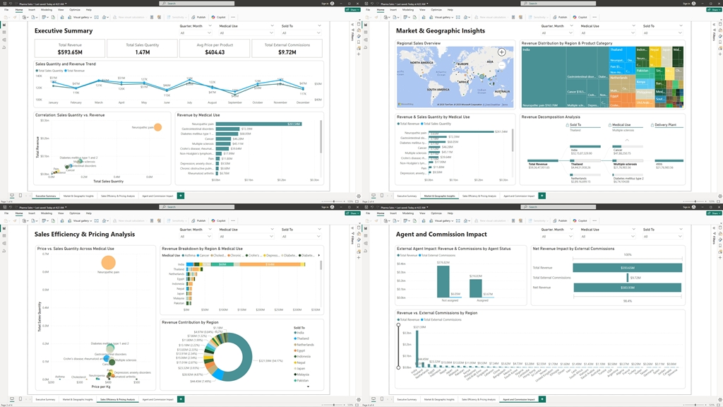
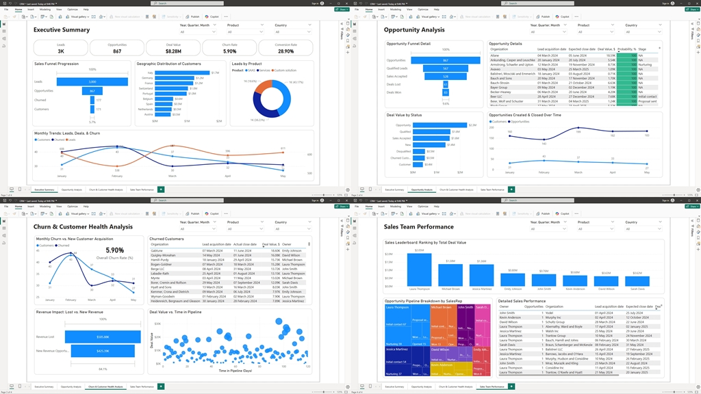
In today’s fast-paced business environment, understanding your sales pipeline and customer behavior is crucial. Through a carefully designed CRM dashboard, we transform raw data into clear, actionable insights that drive smarter business decisions. Here’s an overview of how our reports and visualizations empower you to lead with confidence.
Executive Dashboard: A Bird’s Eye View
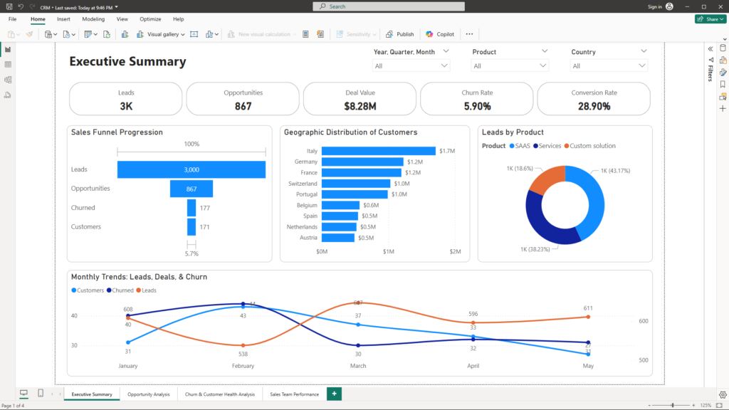
The Executive Dashboard is your cockpit for quick insights:
- Summary KPIs:
- Total Leads, Opportunities, and Deal Value: These cards offer a quick snapshot of the volume of leads, the potential of your pipeline, and the overall monetary value on offer.
- Churn and Conversion Rates: These percentages provide immediate clarity on customer retention and deal conversion—critical metrics for gauging business health.
- Sales Funnel Chart:
Visualize the journey from lead acquisition to conversion or churn. By mapping each stage—Opportunity, Customer, and Churned Customer—you can quickly pinpoint where deals stall and where to focus improvement efforts. - Monthly Trends:
Trend charts display the evolution of new leads, closed deals, and churn events over time, helping you identify seasonal patterns or unexpected dips, so you can act before issues escalate. - Geographical and Product Breakdowns:
A map visual shows which regions are most profitable, while product and industry breakdowns via bar charts highlight the segments driving your revenue.
Opportunity Analysis: Deep Dive into Your Sales Pipeline
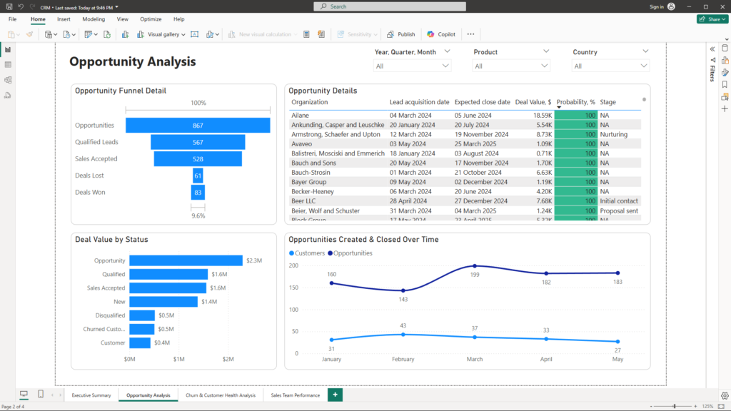
This page provides granular insights into every step of your sales process:
- Funnel and Stacked Bar Charts:
These visuals break down the sales journey by stage—from initial qualification to deal closure. Understanding how many opportunities exist at each stage, along with their associated deal values, empowers you to focus resources where they matter most. - Detailed Opportunity Table:
A dynamic table lists every opportunity with key details like organization name, acquisition and expected close dates, deal value, and probability of success. With intuitive sorting and conditional formatting, high-potential and overdue opportunities stand out for immediate action. - Trend Analysis:
A line chart tracks the creation and closure of opportunities over time, offering a clear perspective on past performance and helping forecast future trends.
Churn & Customer Health Analysis: Measuring the Pulse of Your Business
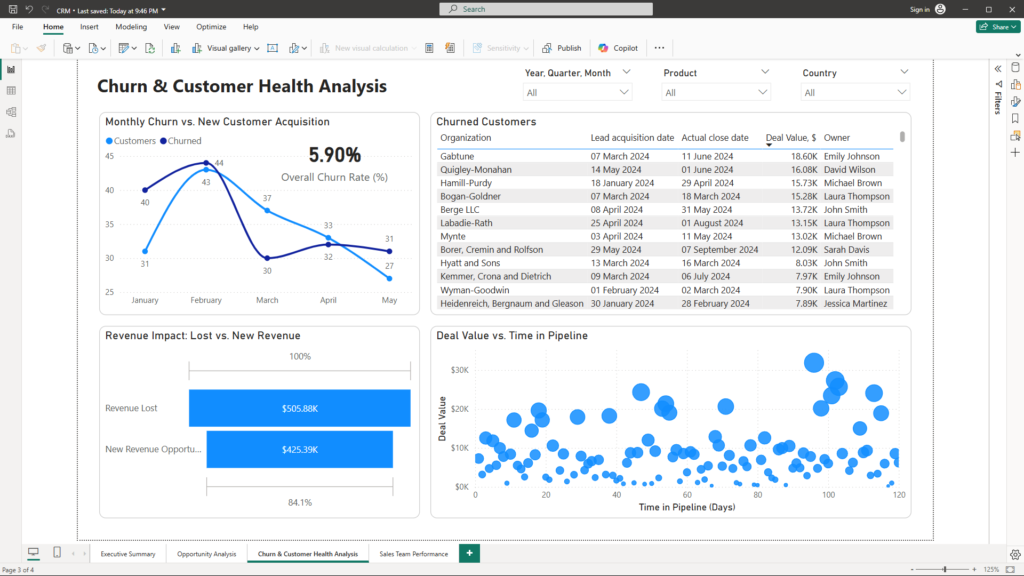
Understanding why customers leave—and how that impacts revenue—is fundamental for long-term success:
- Churn Rate KPI and Trend Chart:
A dedicated KPI card shows your overall churn rate, while complementary charts compare monthly or quarterly churn against new customer acquisition. This dual perspective enables you to detect churn spikes and respond swiftly. - Customer Health Dashboard:
Detailed tables list churned customers with critical details, and scatter charts illustrate how deal value relates to the time taken to close a deal. These visuals help you assess customer health and identify early warning signs. - Revenue Impact Analysis:
A waterfall chart clearly visualizes the revenue lost due to churn versus new revenue opportunities. This helps you understand the financial impact of customer churn and guides strategic decisions for improving retention.
Sales Team Performance: Empowering Your Front-Line Leaders
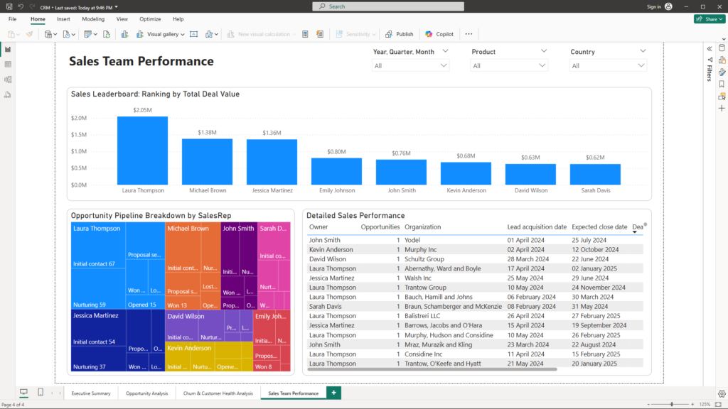
Knowing your team’s performance is key to achieving excellence:
- Sales Leaderboard:
A bar chart ranks sales representatives by total deal value, number of closed deals, and conversion rates, spotlighting top performers and areas needing coaching. - Pipeline Breakdown by SalesRep:
A stacked bar chart or treemap breaks down each sales rep’s pipeline by stage, revealing bottlenecks and highlighting opportunities for targeted improvements. - Performance KPI Cards:
Quick metrics such as conversion rate, average deal value, and total leads handled offer immediate insights into individual and team performance. - Detailed Performance Table:
A comprehensive table lists each opportunity with relevant details, enabling deep dives into performance with dynamic slicers and drill-through capabilities to examine individual lead histories.
Conclusion
Each visual on these pages is designed not just to present data, but to tell a compelling story about your business. From the high-level overview of your pipeline to the granular details of individual deals and team performance, these dashboards empower you to understand trends, identify opportunities, and address challenges proactively. With these insights, you can make strategic decisions that drive growth, improve customer retention, and enhance overall business performance.
Harness the power of data-driven decision-making and unlock the full potential of your sales operations. For more information or to see how these solutions can transform your business, please reach out to me at mail@ssghsoal.com.
Let’s embrace a future where data guides success—together.